Tonight’s GC Digital Fellows workshop on data visualization was a great overview of the tools available for making visualizations and the considerations that anyone must take into account when trying to do so. Michael Mandiberg started by walking us through the difference between infographics (made by people) and data visualizations (made by machines). He discussed the importance of balancing content and form, and the different roles that data visualizations can play — be they for rhetoric, education, persuasion, art, or a combination thereof. He reminded us that anytime you are operating in a visual field, you are navigating design problems. He shared readings and videos — Hans Rosling on Google’s Public Data Explorer, Noah Ilinsky’s Designing Data Visualization, David McCandless’s Information is Beautiful, and the “I Like Pretty Graphs” video on Youtube. He also shared data visualization tools — wordle.net and tagxedo.com to make tag clouds; Google Ngrams to track the frequency of keywords in texts through time; Google Public Data Explorer for easy visualizations of publicly available data sets; Gephi for visualizing networks; and D3, an open-source JavaScript library for all kinds of beautiful interactives. (Here’s a list of the best d3.js examples, which he pointed us to.)
His final takeaways for visualizing data: The most important thing is to start by knowing what question you want to ask. Then find the appropriate form to represent and/or answer your question. Keep in mind that the entire enterprise of your data and software is rooted in a context, form, and ideology. But that said, with data visualization you can learn some really cool stuff.
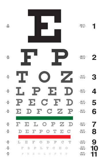
With all of these tools, resources, and examples, the workshop repeatedly returned to pedagogical applications. For example, we explored representations of keywords in presidents’ State of the Union Addresses from various points through US History. These keywords were visualized in an optometrist’s list, with the most frequently appearing words located in the “E” spot. We agreed that these posters would be useful tools to generate discussion about changing trends through American history — for example, what does it tell us that Lincoln’s most prominent word was “Emancipation” and George W. Bush’s was “Terror”?
It’s just one example, but really there are countless applications of data visualization for the classroom.
Thanks so much for this report, Destry! But, just to note: I think this was an ITP workshop, not a GC Digital Fellows workshop.
Thanks for letting me know! I didn’t realize the difference.