I resolved to write a journal of the time, till W. and J. return, and I set about keeping my resolve, because I will not quarrel with myself, and because I shall give William pleasure by it when he comes home again.
And so begins Dorothy Wordsworth’s Grasmere Journals (1800-1803). At first a strategy to cope with her loneliness while her brothers William and John were away, the journals were soon expanded in purpose to provide a record of what she saw, heard, and experienced around their home for the benefit of her brother’s poetry (apparently, he hated to write). There are numerous instances where her subject matter corresponds with his poems, down to the level of shared language. The most cited of these is an entry she made about seeing a field of daffodils; this was incorporated into the much-anthologized poem “I wandered lonely as a cloud,” which ends with a similar scene.
Dorothy and her brother William had a peculiar and unusually close relationship. She was more or less his constant companion before and after they moved to Grasmere. She copied down his poems, attended to his needs, and continued to live with him after he married and had a family, She herself never married, and remained with him until his death in 1850. For these reasons she is often portrayed as a woman who lived for him and vicariously through him.
This impression is reinforced by the nature of her writing, which focuses on the minutiae of day-to-day life, and isolated details of the world around her – weather, seasonal change, plants, animals, flowers, etc. – and which she mentions numerous times will be of use to her brother’s own work. Because her diaries chronicle many long walks in the surrounding countryside, alone or with friends and family, I originally planned to map her movements around the region and connect this movement to the people she was seeing in the area and corresponding with – to map her world, and see how hermetic and localized it really was.
I created the initial data set by downloading and cleaning a text file of the Journals from Gutenberg.org. There were many ways I could have worked with this data set to make it suitable for mapping. I ended up using several online platforms: the UCREL semantic tagger, Voyant Tools, CartoDB, and a visualization platform called RAW. Working back and forth with some of these programs enabled me to put the data into Excel spreadsheets to filter and sort in numerous ways.
When I began thinking about mapping strategies and recording the various data I extracted (locations, people, activities), I saw that to ensure accuracy I would have to corroborate much of it by going through the journals entry by entry – essentially, to do a close reading. Because I was hoping to see what could be gleaned from this text by distant reading, I chose to make a simple map of the locations she mentions in her journal entries, in relation to some word usage statistics provided by Voyant Tools. Voyant has numerous text visualization options, and working with them also encouraged me to think more about the role Dorothy’s writing had in her brother’s creative process; I was curious about how that might be visualized, in order to note patterns or consider the relationship between his defiantly informal poetic diction and her colloquial, quickly jotted prose.
So, I downloaded William Wordsworth’s Poems in Two Volumes, much of which was written during the same period, and processed it in a similar way. Using the RAW tools, I created some comparative visualizations with the total number words common to both texts. I’ve used the images that are easiest to read in my presentation, but there are others equally informative, that track the movement of language from one text to another.
If I were to return to the map and do a close reading, I would include a “density” component to reflect the amount of time Dorothy spent going to other locations, and perhaps add the people associated with those locations (there is a lot of overlap here), and the nature of activity.
I had some trouble winnowing my presentation down to three slides, but the images can be accessed here.
Also, thanks to Patrick Smyth for writing a short Python program for me! I didn’t end up using it but I think it will be very helpful for future data projects.
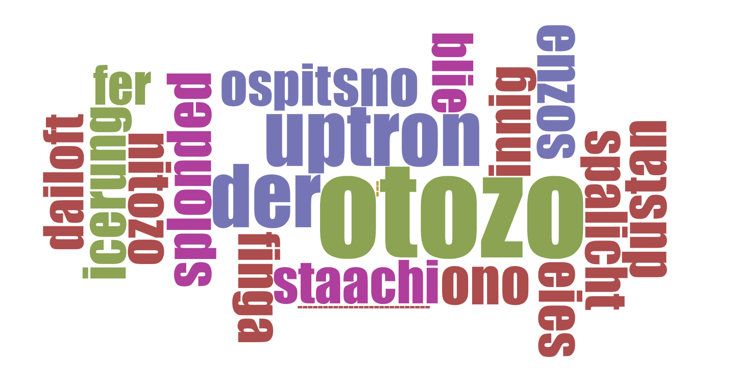 PARADES word cloud
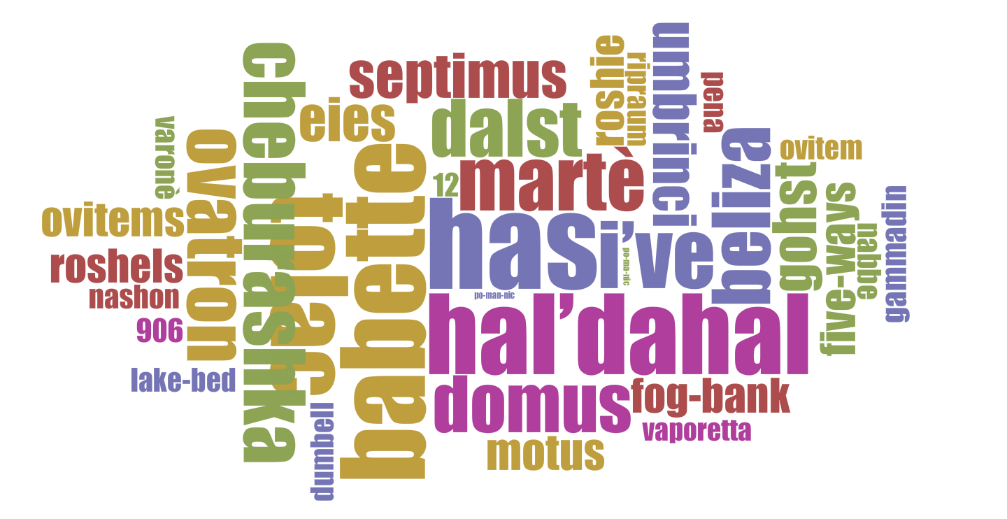 BABETTE word cloud
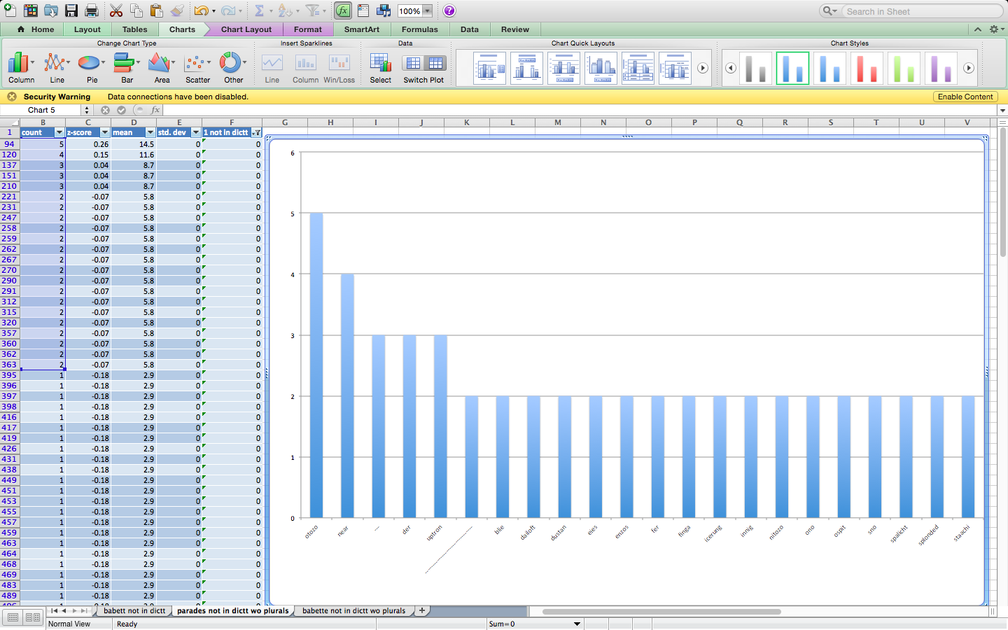 PARADES column graph (screen shot)
 BABETTE column graph (screen shot)