Category Archives: Data Projects

Sculpting in Time: Andrey Tarkovsky ‘s Individual Shot

“History is still not Time; nor is evolution. They are both consequences. Time is a state: the flame in which there lives the salamander of the human soul.” – Andrey Tarkovsky, from Sculpting in Time


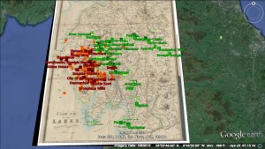
As the semester has progressed, I’ve found, each week, that my sense of what interests and excites me about the current DH landscape is becoming richer, honed, and focused. Even as I marvel at, and have great respect and admiration for the large scale digital analysis that’s going on in the realm of social media scraping , and big data crunching, I keep finding my way back toward the idea of “distortion” and de-formance as a research method and outcome in DH. Jotting down notes that might help me find my way toward a generative approach to DH scholarship, I’ve pulled a surprising combination of books from my shelf for inspiration: John Berger’s And Our Faces, My Heart, Brief as Photographs, In Praise of Shadows by Junichiro Tanizaki, Joseph Cambell’s The Inner Reaches of Outerspace, and  On Weathering: The Life of Buidlings in Time by Mohsen Mostafavi to name a few. My instincts keep drifting toward the aesthetic, and remembering a point Matt made in class about some DH practitioners creating imperfect 3D-printed objects as teaching tools, I scoured the internet for DH studies in Materiality.

vlcsnap-134648

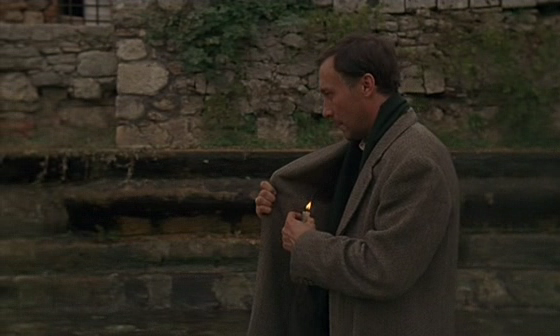
Still taken from Andrey Tarkovsky’s film Nostalgia

In mulling over the DH landscape gradually examined in our readings and class discussions, I’ve found, in a way, that I’ve been chasing myself. In a course focused less on subject matter, and more on methodology and approach, I’m forced to burrow down into what really motivates me in my learning. This week, I was blown away by the work that Kevin is doing with ImageJ. I’m excited to the point of jumping the gun on this blog post when I think about the potential projects that might come about when building and theorizing around the ImageJ software. Today, I downloaded the ImageJ package for Mac OS X Java App. I’ll begin experimenting with it in the coming weeks. For my initial data project, I would like to analyze a bundle of still frame from a film by Andrey Tarkovsky (The Mirror, or The Sacrifice, or potentially, Stalker). Alternatively, and somewhat thematically as the flame of time indicates in the epigraph to this blog post, I would love to analyze the nearly 10-min sequence in Nostalghia where the film’s main protagonist walks the length of a long fountain, all the while shielding the flame of a candle he cradles inside his overcoat to prevent it from going out. I hope for this data exercise to be an entryway into a more focused thesis for a larger project. (Not necessarily of a similar vein, but definitely derivative of what I learn in the process). I’m currently reading Tarkovsky’s cinema theory monograph, Sculpting in Time. What I hope to learn from a project that analyzes an iconic, yet not widely-viewed director in this initial data project is modest. In addition to creating an outcome that can visualize the “sculpting” in time of Tarkovsky’s films, I hope to get a sense of his sculpting of time by utilizing the ImageJ Stacks menu.

I’ve always loved Tarkovsky’s films, even though, at times, I find them difficult to watch. They’re  ghostly, beautiful, and most often, mysterious. Tarkovsky’s rhythmic examinations of nature and landscape of all types and scale with slow, drawn out single shots that seem to extend far longer than their actual temporal length have always contrasted with the contentious, even dangerous political climate that existed in modern Russia during the time in which they were created.  I hope to take on this small-scale project as a way to delve deeper into a subject that stimulates me. And from there, I will turn my gaze toward the DH community at large to try and locate gaps in the collective methodological toolbox, or places from which I can propose and launch a meaningful contribution on a larger scale.

Next step, capture and organize a bundle of still frames. And get my feet wet using ImageJ Stacks.

Teen pregnancy in NYC dataset

New York City has an incredible amount of data available on their website for the public to explore. They have annual summary reports, as well as interactive tools where one can select variables they are interested in seeing. The instantly available data is already crunched, but one can request “raw” data with an online request form. According to the instructions, it can take anywhere from two to four weeks for the files to be sent to you.

For the dataset project, I am interested in exploring the teen pregnancy rates in the five boroughs. I will start playing with the data and see what correlations stand out to me when I visualize them using various visualization tools. Perhaps I will notice something beyond the correlation between economic status and unplanned pregnancy and discover something new for me. On Wednesday, I went to the Digital Fellows office hours and talked to Patrick Smyth, Hannah Aizenman, and Stephen Zweibel about my options. They suggested I start with Excel pivot tables and then move on to Gapminder and Tableau to see what I can do there.

Special shout-out to Davide for his post on the Data Visualization workshop 🙂

Data Project: Reading Transnationalism and Mapping “In the Country”

Last week, we discussed “thick mapping” in class using the Todd Presner readings from HyperCities: Thick Mapping in the Digital Humanities, segueing briefly into the topic of cultural production and power within transnational and postcolonial studies (Presner 52). I am interested in what the investigation of cultural layers in a novel can reveal about the narrative, or, in the case of my possible data set, In the Country: Stories by Mia Alvar, a shared narrative among a collection of short stories, each dealing specifically with transnational Filipino characters, their unique circumstances, and the historical contexts surrounding these narratives.

In the Country contains stories of Filipinos in the Philippines, the U.S., and the Middle East, some characters traveling across the world and coming back. For many Overseas Filipino Workers (OFWs), the expectation when working abroad is that you will return home permanently upon the end of a work contract or retirement. But the reality is that many Filipinos become citizens of and start families in the countries that they migrate to, sending home remittances or money transfers and only returning to the Philippines when it is affordable. The creation of communities and identities within the vast Filipino diaspora is a historical narrative worth examining and has been a driving force behind my research.

For my data set project, I hope to begin by looking at two or more chapters from In the Country and comparing themes and structures using Python and/or MALLET. The transnational aspect of these short stories, which take place in locations that span the globe, adds another possible layer of spatial analysis that could be explored using a mapping tool such as Neatline. My current task is creating the data set – if I need to convert it, I could possibly use Calibre.

Digital Dorothy

As I described in the last class, I’m going to use a data set that is a text.  At first, I wanted to create a “diachronic” map of a particular place—the English Lake District—which is a popular destination for hikers, walkers, photographers, and Romantic literature enthusiasts. This last category also includes a great many Japanese tourists.

My first plan was to create a corpus of 18th– and 19th-century poetry and prose related to the Lake District (read: dead white males), explore the way landscape was treated, map locations mentioned in these texts or create a timeline, and then add excerpts of text along with the present-day visual data.

For the present-day component, I was thinking about how to scrape and incorporate data and photos from Flickr and Twitter that were tagged with the names of local landmarks and landscape features of the area.

mapping the lakes image in Google Earth

An image from Mapping the Lakes in Google Earth

Early on, I discovered Mapping the Lakes – a 2007-2008 project (apparently still in pilot phase) at the University of Lancaster that uses very similar strategies to explore constellations of spatial imagination, creativity, writing, and movement in the very same landscape. From the pilot project:

The ‘Mapping the Lakes’ project website begins to demonstrate how GIS technology can be used to map out writerly movement through space. The site also highlights the critical potentiality of comparative digital cartographies. There is a need, however, to test the imaginative and conceptual possibilities of a literary GIS: there is a need to explore the usefulness of qualitative mappings of literary texts… digital space allows the literary cartographer to highlight the ways in which different writers have, across time, articulated a range of emotional responses to particular locations … we are seeking to explore the cartographical representation of subjective geographies through the creation of ‘mood maps’.

The interactive maps are built on Google Earth; therefore, don’t try to view this in Chrome. You can also use the desktop version of Google Earth. The project is quite instructive in its aims as well as its faults and failures, and the process and outcomes are described on the website. (Actually, the pilot project might be a very good object lesson on mapping creative expression with GIS.)

However, if you’re interested in this kind of mapping, you should take a look at the Lancaster team’s award-winning research presentation poster on their expanded Lakes project:

I wrote to one of the authors to ask her about it—methodology, data set, etc. She was happy to respond, and was encouraging. Although the methodology is way beyond my technical chops at present, she referred me to a helpful semantic text-tagging resource that they used, and I’m sure will come in handy at some point.

After some floundering around, I defined a data set and project that is challenging but more manageable. It will involve a map and one text: an excerpt of Dorothy Wordsworth’s journals, from 1801-1803— not long after the second edition of Lyrical Ballads was published, and she and her brother moved to the area with their friend Samuel Taylor Coleridge.

The journals are a counterpoint to William Wordsworth’s early poetry, in that she kept them as much for her brother as for herself—recording experiences they had together, and personal observations that she knew would inspire him—to provide the raw material for his poems. There is a not extensive yet established amount of scholarship on the subject. She even describes this collaborative process in her journal—although it’s not called collaboration, and until more recently wasn’t characterized as such by critics.

To prepare the data set, I downloaded the text file of the most complete edition of her journals from Project Gutenberg, took out everything not related to this time period, and did a lot of “find and replace” work to get rid of extra spaces and characters, editorial footnotes, standardize some spellings, and change initials to full names. Following the advisories on the semantic tagging and corpus analysis sites, I also saved the file in both ASCII and UTF-8 text formats, with line breaks. (This may or may not prove necessary, depending on the tools I use later on). I have considered using a concordance tool of some kind (like Antconc) to visualize those connections, since I don’t think that has been done. However, this would entail creating a second data set with the book of poems and it’s a secondary interest.

My primary goals are these:

  • I’m hoping this project will confirm or complicate existing assumptions about Dorothy and her journals, which until now—as far as I know—have only been developed through close reading, not visualization.
  • Using this text, I want to map her life in the Lake District during this period – socially, physically, and emotionally. (In her brother’s case, his poetry does a good job of that, and stacks of books have been written about his relationships to other people, women, landscape, time, etc.)
  • I want the map to be interactive to some degree, so that users can trace these different aspects of her life geographically, by clicking on related keywords. Ideally, I would like to include supplementary images—paintings, engravings, and portraits—that were created in the era, to provide a contemporaneous visual component. Including related excerpts of journal or poetic text would also be helpful: it would be a means of mapping her creativity, in a way. A similar map of  William Wordsworth‘s creativity exists. It is more extensive but not very user-friendly.

On the cartographical front, I have been considering CartoDB and Mapbox. I also looked at the British Ordnance Survey topographical map of the area, which, like all the ordnance maps, is now online. The OS website includes a feature similar to Google maps, whereby you can personalize maps to some degree, and connect text and image data. Of course, Google Earth can be used this way too. Mapbox has nice backgrounds, but less options. CartoDB is visually pleasing,  versatile, and allows for more elegant “pop ups,” which I could use to include bits of text, images from the time, etc. But it can’t be embedded into a webpage. As they come into focus, the project goals will ultimately determine what I use.

In the meantime, I’m using Voyant to explore the text/data set. It is a great resource to help you define the parameters for a more focused project. You can see what I’m working with here. Eventually I will geocode the locations, either by hand or via Google Maps, input location data, temporal data, and data about her social interactions (all in the text) in a CSV file that can be uploaded into a mapping program, and figure out how to connect everything . (Or I will die trying.) I also plan to study the new and improved “Mapping the Lakes” project more carefully, for ideas on how best to present my own, less ambitious project.

Along the way I’ve encountered some other software that may be useful for those of us who like working with olde bookes: VARD is a spelling normalization program for historic corpora (also from Lancaster U. It requires permission to download but that is easy to get).

That is all.

Data Project: Using CartoDB (possibly)

I talked to one of the Digital Fellows and clarified what Web Scraping was. I’m not doing the project I posted. I couldn’t understand how the entire Internet could be scraped by anything, but now I understand that it’s only whatever webpages I select. This won’t do. I will get no real information out of it.

I have come up with another project, though: mapping Greco-Roman libraries. This would be something that I could use in my own research. I have already registered for the Storytelling with Maps class, and it sounds exciting. I’m interested to see what I can do with CartoDB. If the software is robust enough, I can use the map as a complement to my current research, and expand it in the future.

I have a list of 20 or so ancient libraries that need to be plotted on a map of the Mediterranean world. It would be useful to have this type of map to refer to when I’m working online.

Data Project: AAU Campus Survey on Sexual Assault and Misconduct

In September, the Association of American Universities published a widely-publicized survey on sexual assault and misconduct on college campuses. Here is the survey overview:

“The primary goal of the Campus Climate Survey on Sexual Assault and Sexual Misconduct was to provide participating institutions of higher education with information to inform policies to prevent and respond to sexual assault and misconduct. The survey was designed to assess the incidence, prevalence and characteristics of incidents of sexual assault and misconduct. It also assessed the overall climate of the campus with respect to perceptions of risk, knowledge of resources available to victims and perceived reactions to an incident of sexual assault or misconduct.”

For my data project, I’m interested in scraping data tables from the report (only available in .pdf), and then playing with analysis and visualization of them. This is both a chance for me to learn more about the data collected through this survey — data I’m interested in anyway — and an opportunity to play with software and programs that I’ve wanted to try out. R is an example, as well as some visualization programs that I haven’t used before. I might try scraping through Python. And I think it could be interesting to try to apply MALLET to the report in its entirety.

I’m curious if visualizing the data in different ways presents findings that are at all inconsistent with the official findings of the report. Or if new renderings of this data give rise to different research questions for campus surveys in the future. I’m also open to other ideas for exploring the data if you have them!

Data Set Project – Titanic Survivors

I’ve thought of and discarded a number of ideas about what to work on for my data set project. I started looking through lists of publicly available data sets hoping something would catch my interest or inspiration would strike.

At https://github.com/caesar0301/awesome-public-datasets I came across a csv file with Titanic passenger survival data. The file listed passenger names, sex, cabin class, and ticket price as well as other information. I thought it could be an interesting set to work on.

The problem with finding information from a collection called “Awesome Public Datasets” is that there was absolutely no information about who created this file or where it came from. After some more digging I found a similar data set posted by the Department of Biostatistics at Vanderbilt University, complete with information about who created and where they found their information.

http://biostat.mc.vanderbilt.edu/wiki/pub/Main/DataSets/titanic3info.txt

While the history of the Titanic and it’s passengers is well covered, but I like the idea of testing some of my assumptions about this data, and considering interesting or unexpected questions to explore.

For example I assume there will be a direct correlation between how much a passenger paid for their ticket, and whether or not they survived. I also expect to see a similar relationship with gender, with the assumption that women were more likely to survive than men. If both of those assumptions appear to be true after examining the data, then I’m curious whether wealth or gender will appear to be a more substantial factor.


Poetry, Appropriation, and the “Avant-Garde”

For my data project (and perhaps leading into the final project), I’m interested in finding a way to map, graph, or visualize a set of linguistic / formal trends in contemporary poetry. Based on a set of inter-connected issues and ideas, I’ve arrived at the following question, which is probably still too large: what is the relationship between “appropriation,” race, and gender in poetry of the “avant-garde”?

In coming up with this question, my first idea was to use digital tools to see how certain words or trends in language have been appropriated (or repurposed) in poetry. How much is “creative” (i.e., original) and how much is “uncreative” (i.e., stolen), and where is the line between the two?

As a writer who has almost always used other texts to generate my own, I know the politics, practice, and implications of this question are complicated. It’s certainly not a question that can or should be cleanly “solved,” but perhaps that makes it fertile for a digital project. And a number of recent course readings (e.g.,” Topic Modeling and Figurative Language”), workshops (Web Scraping Social Media) and blog posts (Matt’s on “Poemage”; Taylor’s on “Hypergraphy”) have lead me to believe there are some tools I could explore to attempt this kind of “close”-and-“distant” reading.

But what do I mean by “language,” “appropriation,” and “contemporary poetry”? Which text(s) do I want to analyze, and how?

I thought of looking at poems in the most recent issue of Best American Poetry, if only because of the controversy surrounding a particular poem by a white man named Michael Derrick Hudson in that anthology. Hudson submitted his poem 40 times under his own name, and then 9 times under the pseudonym of Yi-Fen Chou, hoping that by posing as a Chinese woman (“appropriating” a particular name and identity), his poem would be accepted. And eventually, it was. According to Hudson, “it took quite a bit of effort to get (this poem) into print, but I’m nothing if not persistent.”

(The idea of “persistence” lead me to a (possibly) related question: how often do men, women, and POC submit the same piece of writing for publication, and how often are they published? Is this even a type of data that I could find?)

On a language level, an analysis of “appropriation” in a selection of texts could look something like this: take a set of poems (perhaps from that same issue of Best American Poetry), and use tools like Poemage or Topic Modeling to identify certain language trends: words, phrases, or perhaps bigger-picture patterns, like syntax, formal constraints, or rhyme. Then, scrape the web to see how and where these language and formal trends have been used prior to these poems: in literature, and / or in other places (blogs, social media, etc.). And if this dataset is too unmanageable, perhaps just look for how language from non-literary texts gets “appropriated” into poetic texts. This doesn’t relate to “appropriated” language to race and gender yet, but I’m getting there.

Another idea I had for the dataset (which I originally thought of as separate, but now seems related), was to use language-analysis to ask: what “is” (or marks) the “avant-garde” in poetry?

It’s hard, and perhaps silly, to try to define or locate a set of poems that are somehow representative of the “avant-garde,” which is itself a problematic term: most likely only historical, and not really in or of contemporary use. But the reason I thought of this question was my interest in an essay titled “Delusions of Whiteness in the Avant-Garde” by Cathy Park Hong, almost a year prior to the Michael Derrick Hudson case, in the journal Lana Turner – a journal “of poetry and opinion” in which I have published often, and which might also be thought of as a home for the “avant-garde.” In this essay, Hong claims that “to encounter the history of avant-garde poetry is to encounter a racist tradition.” A second dataset would then be in service of documenting and support this claim (and those that follow) through maps, graphs, or even hypertexts.

To do so, I might first take the poems in (lets say, that issue of Lana Turner), and use (lets say, “topic modeling”) to see if any words, syntax, or forms can be constituted into a pattern that might be used to define “the avant-garde” (or at least, the machine’s perception of it). To be more specific by borrowing some terms from Hong’s essay: what are the “radical languages and forms” that have been “usurped” (appropriated) without proper acknowledgement? What are “Eurocentric practices” in poetry these days? How can I use digital tools to further define these terms, and then map them against the race and gender of their authors? How does this information relate to the “persistence” with which (these poets) tend to submit their work? Is this part of the same dataset, or related?

The biggest issue with my proposal seems to be figuring out the scope of the project; how many and which texts to analyze. If I just use the most recent issues of Best American Poetry and / or Lana Turner, would I have enough, or too much data? And if I’m exploring these greater social issues, should I instead be mapping the controversies surrounding this discourse (on social media, for example), rather trying to analyze any particular text itself? How could I possibly choose texts that are representative of such large claims? One tentative thought I had was to analyze my own poems. This approach is appealing, not only because I’m most comfortable targeting myself, but also because it could offer the clearest dataset. That said, I hesitate to make this “critical” project about my own creative work, about which I may know or think too much, or at least, too much more than an algorithm or computer. And my poems are certainly not “representative” on their own.

That’s enough of this meandering post for now – – (I’m glad I can edit this) and welcome any thoughts or feedback – –

– – Sara

PS – and if this “dataset” proves too large or complicated with its various tools and politics (which I’m starting to think it very well might), another idea I have (not related!) is to analyze the language (again: words, syntax, and structural forms) that teachers (adjuncts and or full-time professors) use in their writing composition syllabi (lets say, within the CUNY network), as well as looking at the texts that they teach. I’m pretty sure that “official” student evaluations are made public (at CUNY, teachers need to agree to this) – but there is also the (problematic, but possibly useful) Rate My Professors, among other blogs and social media where student reactions might occur. It could be interesting to look at the relationship between how composition syllabi are written and how students perform and / or react. And I think this project could lead to the kind of “browsing” that Stephen Ramsey describes, where as my long, pervious proposal above might constitute too much of a “search,” and one that is overloaded, at that.

New Cool DH Tool

I subscribe to the American Antiquarian Society blog Past is Present, and I receive all sorts of wonderful things in the emails from them.

After two years of DH development under the guidance of a DH fellow – Molly O’Hagan Hardy – the AAS now has a dedicated DH curator (same person) and an official DH component of their mission, which means (I hope) that even more of their resources will be available to lay-antiquarians like me who cannot slog up to Worcester, MA and noodle around in the archives just for kicks.

Their image archives are especially fun to peruse, and they offer a wealth of resources under the Digital AAS banner.

Anyway, this MARC records conversion tutorial just fell over the transom of my inbox, and I think it could be a very useful tool for one or some of us, if not now, then in the future. Putting your data into a CSV format opens up many possibilities, including data visualizations.

Lisa


Terrorism Data

Hi all,

I am interested in studying the history of domestic terrorism in the U.S., so I went looking for datasets to that effect. What I was hoping to find was a comprehensive repository that covered most, if not all of U.S. history, and included incidents like the Oklahoma city bombing, alongside attacks on abortionists, hate crimes, and lynchings in the post-Civil War era (In the best of all possible databases, the decimation of Native American communities and cultural practices would also be included, even though the FBI defines terrorism as requiring illegal acts, and often enough the crimes against these communities were legally-sanctioned). Additionally, I was hoping to find basic information on who the victims and perpetrators were (at least with regards to incidents from the last few decades), as well as historical context for each incident. Perhaps I went looking in the wrong place, but as of now it appears that such a comprehensive database doesn’t exist, which is odd and upsetting. However, I did find smaller, though still formidable, datasets that tackle parts of the problem. One of these is from the Global Terrorism Database, maintained by the University of Maryland, which provides information on terror attacks worldwide. Granted, their information only goes back as far as 1970 and it neither includes hate crimes nor legally-sanctioned terror against ethnic groups. That said, their dataset is still the most informative and usable of what I’ve found so far, because it consists of the raw data behind their charts (i.e. information on each and every incident counted). More often than not in my search I found well-meaning organizations that provided aggregate counts rather than the specific data that went into those aggregates, so I was very grateful to find Maryland’s GTD.

I am going to use it to a) mine its listings of domestic terrorism in the U.S. and b) to compare incidences of terror – both domestic and international – in the U.S. with terror in the Middle East. Over the course of this semester, I would like to work towards making animated visualizations of what I find in here. I am excluding events from the rest of the globe outside these two areas just for the sake of manageability.

— Ashleigh