Tag Archives: workshops

GIS workshop

A few weeks ago I was fortunate to be able to attend an all-day GIS workshop offered by Frank Connolly, the Geospatial Data Librarian at Baruch College. It was very thorough and by the end everyone had finished a simple chloropleth map. For those of you interested in continuing with map-related DH and can spare a friday, I recommend the workshop, which is free and offered several times a semester.

Most professional GIS projects use ArcGIS, made by ESRI, and many institutions subscribe to it to support their GIS projects. It’s not cheap. But, (yay!) there is an open-source alternative called QGIS, which anyone can download. This is the software we used in the workshop. QGIS is far more versatile than CartoDB, but it also has a complex interface and a steep learning curve.

In the workshop, we covered the pros and cons of various map projections (similar to some of our readings) and different types of map shapefiles (background map images); GPS coordinates vs. standard latitude/longitude (sometimes they differ) ;how to geo-rectify old maps so that they line up with modern maps and geocoordinates; open data sources; and how to organize and add information to a QGIS datababse.

The entire workshop tutorial, which participants took home, is available on the Baruch library website. If you’re comfortable learning complicated software on your own, it’s a great resource. Personally, I would need to spend a lot more time working with QGIS, with someone looking over my shoulder, to get a feel for the program. But practicing with the manual over the winter break will be on my ever-growing “to-do” list.


Workshop – Data Visualization

The data visualization workshop (10/29) was particularly helpful in understanding how data visualization should be approached. Indeed, the digital fellows stressed to importance to think and visualize with our minds before working with data.

Assuming that we already have a particular set of data, it is essential to understand what and how we would like to visualize. Therefore, it is useless to start right away with excel (and it was indeed, interesting how many of us had this impulse of using right away that software but without really knowing what to do).

We started with a data set sample providing different information about the Titanic’s passengers (gender, survived, age, name, class, etc.). The following step was the decision of which relationships we wanted to visualize. So, (and this is just an example) we picked a few categories such as survival and class, in order to see their relationship. How did class affect the survival rate?

Then, by using some crayons and a white piece of paper, we tried to imagine and reproduce how we wanted to visualize the questions we asked to our data and their relationship.

Pretty soon the how became the big issue. How does a particular visualization convey certain information? How can we avoid confusion and provide a clear understanding of a particular issue?
So, for instance, we moved quite quickly from the pie diagram to different kind of graphs. The pie does its best when we want to show two things: one independent and one independent, in other words, how much is one thing in percentage to the other thing.
In order to provide a clearer representation of more than two categories we looked for a different kind of visualization.
In this process we learned to look carefully at 4 categories that can help us in elaborating different categories and variables in the same visualization:

1) line
2) color
3) shape
4) area/fill

Line_Shape_Color_area

After having chosen the data, and the relationship we wanted to represent, we entered our data in excel. From this point on, we learned to use a powerful excel tool: pivot tables. This function allows users to sort and summarize data according to different criteria. This selection is then represented into a second table. In other words, pivot tables help in understanding particular realtionships and trends in larger data set.

Pivot tablesFrom this point on, we could use Excel’s previews of different graphs in order to understand which visualization we could use to construct the most effective representation of the relationship we wanted to emphasize.

Finally, the digital fellows suggested us many different softwares paricualry helpful for data visualization:

GUI Based:
– google charts
– tableau

R-ggplot
Python-matplotlib/seaborne/basemap/cartopy
Javascript-D3

Mapping:
GIS-ArcGIS
CartoDB —> change over time

p.s. I’m sorry for the excel picture in Italian 🙂

DH Grammar

Last night I attended my first workshop this semester – The Lexicon of DH – and I found it extremely helpful. I was expecting something like a PowerPoint survey of terms, tools, and basic categories, with a bunch of tired people in a classroom. Instead we had an interactive and hands-on workshop in a computer lab, with fellows who have a comprehensive understanding of the material and really know how to teach effectively. That the material could comprise a DH “grammar” was a perspective I hadn’t considered before. I would have called it an “arsenal” – tools. But grammar is especially fitting, because grammar structures meaning at its most basic level, and each tool structures meaning and mediates information – in its own way – at a basic level that should be thoroughly understood before it is used.

Actually, the workshop was a PowerPoint survey of terms, tools, and categories. But having very engaged people coach us through an exploration of this material “in situ” – that is, online, where it lives – made it far more accessible. Too often I find I am still stuck in the “stand-alone” mindset when it comes to digital tools. For instance, although I have used a number of the tools we covered, like Zotero,  I actually haven’t taken advantage of Zotero’s online functionality very much, in terms of capturing bibliographic info. and metadata.  Sometimes you need someone to show you what is right in front of your face. (I do, anyway.)

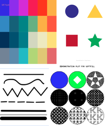
Being introduced to so many resources for different types of DH tasks and projects in a single two-hour session was a little frustrating.*   And, the plethora of possibilities led me yet again to rethink what my data set should include or explore. That said, I’ve already been exploring a number of different tools on my own – and even have an academic subscription to Tableau, a visualization program – yet have at best a novice’s sense of how best to use any of them. So, I found that even this short summary of certain tools’ capabilities was helpful, in terms of winnowing out what may not be as useful for me right now.  It’s easy for me to get distracted by pretty, shiny websites, and it finally dawned on me that perhaps I should not let the tool I like the most determine my data set – at least when I have minimal or no user experience.

In addition to the material we covered, it was helpful simply to describe my areas of interest in a couple of sentences, look at some examples of projects online, and hear about what other people do or want to do. I was able to step away from the monitor briefly (metaphorically speaking) and affirm that indeed history, texts/material artifacts, and geo-spatial mapping are “my bag,” and that I want to work on something that uses all of these components.+ On the other hand, I still feel the need to connect my rather dusty academic interests (18th C English literature) to contemporary experience and/or socially relevant issues, and this pressure doesn’t help when it comes to figuring out what data sets to find or create and play with.

So, to be continued…

*   I know that workshops for specific tools and programs are held, but they are so limited in terms of space and scheduling that what is an extremely necessary academic resource for most new DH students is not as accessible as it should be.  This is especially true for those of us who work 9-5 and can’t frequent office hours or workshops held earlier in the day. I really hope that this situation will be remedied.  Also, I suggest some in-depth workshops that focus on different types of projects – specifically, which tools and programs can facilitate research, enhance content, and improve functionality for various project types.

+  Last semester, I attempted to do something a little like this in Lev Manovich’s visualization class. For our final project, we each had to create a data visualization reflecting our own experience, so history with a big H was not involved. My project comprised a short, reflective essay with sound files and an interactive map in CartoDB. I had hoped to put everything together on one page, but it is either not easy or else impossible to embed a CartoDB map on a WordPress site.  As a hybrid visualization exercise, it is fine. But my goal for this class is to develop a project that can employ these elements — history, text (which is an elastic term) and mapping in a more comprehensive, meaningful, and engaging way, and that – most important – has both historical and contemporary relevance.  If anyone is curious what that looked like, it’s on my long-neglected blog.