Author Archives: Destry Maria Sibley

Data Set Project: AAU Report on Sexual Assault

My data set project turned into an exercise in parsing and cleaning data before all else. I knew that I wanted to look into the current climate of sexual assault on college and university campuses, but there were a number of places to look for data on the issue. I landed on the Report on the Association of American Universities Campus Climate Survey on Sexual Assault and Sexual Misconduct. This report was the most recent, had the most immediately accessible data, and had been widely publicized when it was released earlier this fall. (See, for example, the NYTimes’s September article, “1 in 4 Women Experience Sex Assault on Campus.“) I contacted the AAU and made multiple attempts to access the original survey results, but in the end had to resort to the data tables as they appeared in the report.

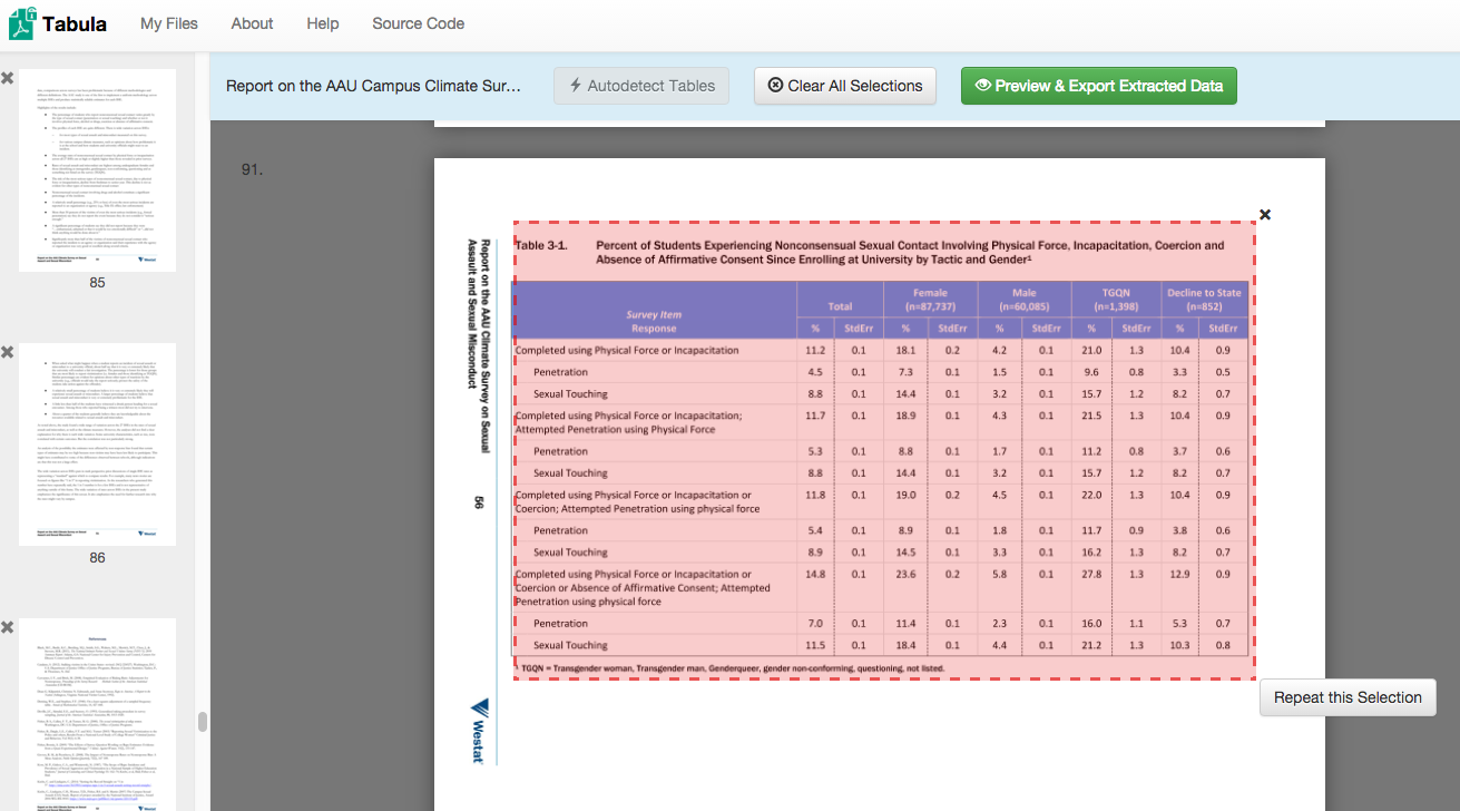
This data table is where I began — with the percent of students experiencing different forms of nonconsensual sexual contact, organized according to their gender.

Screen Shot 2015-11-28 at 1.34.45 PM

I then used the web software Tabula to scrape the data from the .pdf…

Screen Shot 2015-11-28 at 1.52.05 PM

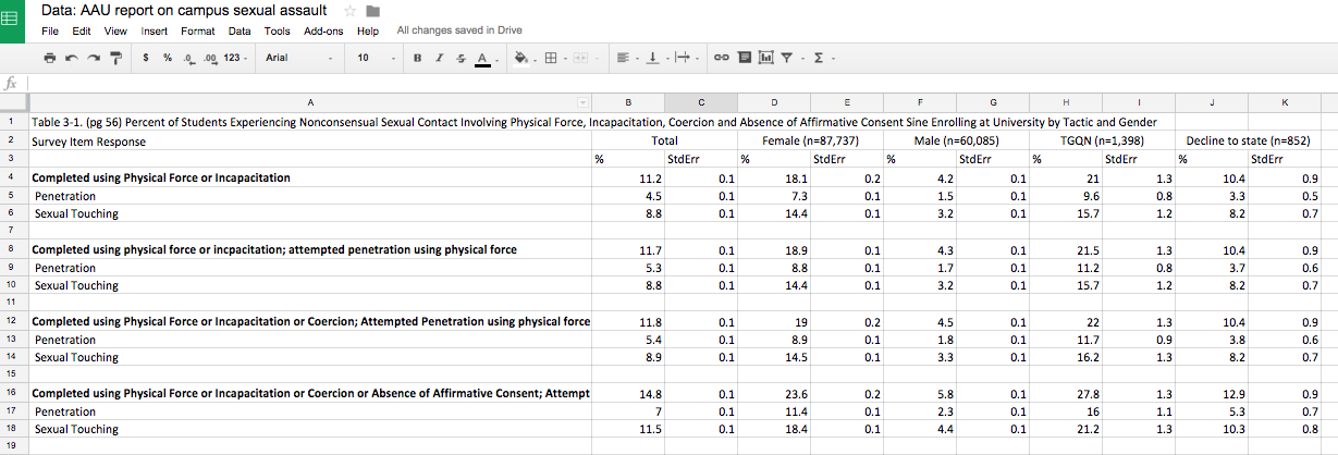
…cleaned and exported to Google Sheets…

Screen Shot 2015-11-28 at 1.34.01 PM

…and cleaned and imported into Plotly.

Screen Shot 2015-11-28 at 1.32.58 PM

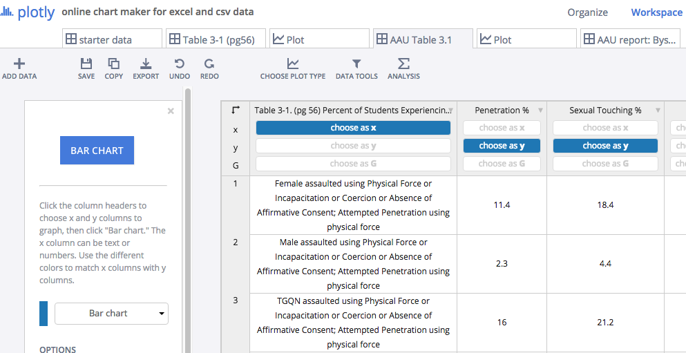
At every step of the way I was reorganizing the data to focus on the story that I most wanted. When I first started graphing, the data looked like this:

newplot (2)

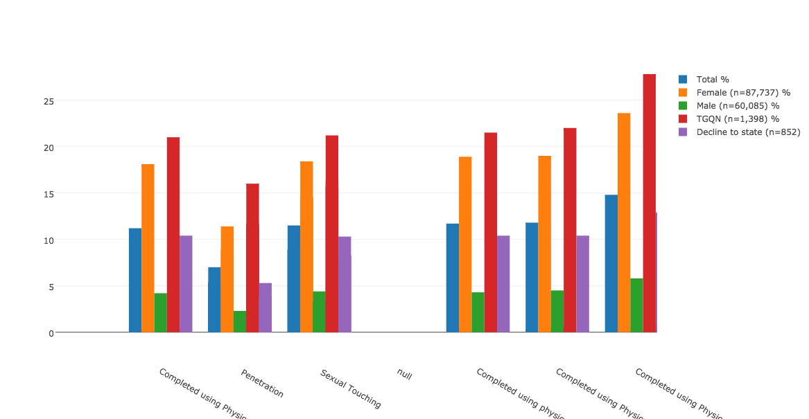
Until I continued to manipulate it to get it to look like this:

newplot (3)

This exercise speaks to the amount of parsing, cleaning, selection, and editing that is necessary to arrive at even the simplest of bar charts. But I appreciate it for the new pieces of information that emerge from analyzing data through this process. For example, consider the high percentage of TGQN (that’s transgender women, transgender men, genderqueer, gender non-conforming, and questioning students, and those whose gender wasn’t listed) that are experiencing some form of assault on their campuses. Most media coverage of this issue has focused on the victimization of female students, but apparently there’s also a critical story here about the safety of TGQN students — something that I didn’t realize until I went through the motions of visualizing the data, and that probably a lot of other people are missing too.

As far as Plotly as a tool for visualization, I found it to be relatively easy to use, especially for someone who doesn’t know how to code. But I prefer Highcharts for the greater autonomy and flexibility it allows the user. That said, Highcharts is a JavaScript library, and as such requires some degree of JS knowledge to manipulate.  For anyone who wants to churn out a pretty quick, pretty attractive, and very shareable graph, I think Plotly is a good choice.


Data Project: AAU Campus Survey on Sexual Assault and Misconduct

In September, the Association of American Universities published a widely-publicized survey on sexual assault and misconduct on college campuses. Here is the survey overview:

“The primary goal of the Campus Climate Survey on Sexual Assault and Sexual Misconduct was to provide participating institutions of higher education with information to inform policies to prevent and respond to sexual assault and misconduct. The survey was designed to assess the incidence, prevalence and characteristics of incidents of sexual assault and misconduct. It also assessed the overall climate of the campus with respect to perceptions of risk, knowledge of resources available to victims and perceived reactions to an incident of sexual assault or misconduct.”

For my data project, I’m interested in scraping data tables from the report (only available in .pdf), and then playing with analysis and visualization of them. This is both a chance for me to learn more about the data collected through this survey — data I’m interested in anyway — and an opportunity to play with software and programs that I’ve wanted to try out. R is an example, as well as some visualization programs that I haven’t used before. I might try scraping through Python. And I think it could be interesting to try to apply MALLET to the report in its entirety.

I’m curious if visualizing the data in different ways presents findings that are at all inconsistent with the official findings of the report. Or if new renderings of this data give rise to different research questions for campus surveys in the future. I’m also open to other ideas for exploring the data if you have them!

GC Digital Fellows workshop on Data Visualization

Tonight’s GC Digital Fellows workshop on data visualization was a great overview of the tools available for making visualizations and the considerations that anyone must take into account when trying to do so. Michael Mandiberg started by walking us through the difference between infographics (made by people) and data visualizations (made by machines). He discussed the importance of balancing content and form, and the different roles that data visualizations can play — be they for rhetoric, education, persuasion, art, or a combination thereof. He reminded us that anytime you are operating in a visual field, you are navigating design problems. He shared readings and videos — Hans Rosling on Google’s Public Data Explorer, Noah Ilinsky’s Designing Data Visualization, David McCandless’s Information is Beautiful, and the “I Like Pretty Graphs” video on Youtube. He also shared data visualization tools — wordle.net and tagxedo.com to make tag clouds; Google Ngrams to track the frequency of keywords in texts through time; Google Public Data Explorer for easy visualizations of publicly available data sets; Gephi for visualizing networks; and D3, an open-source JavaScript library for all kinds of beautiful interactives. (Here’s a list of the best d3.js examples, which he pointed us to.)

His final takeaways for visualizing data: The most important thing is to start by knowing what question you want to ask. Then find the appropriate form to represent and/or answer your question. Keep in mind that the entire enterprise of your data and software is rooted in a context, form, and ideology. But that said, with data visualization you can learn some really cool stuff.

With all of these tools, resources, and examples, the workshop repeatedly returned to pedagogical applications. For example, we explored representations of keywords in presidents’ State of the Union Addresses from various points through US History. These keywords were visualized in an optometrist’s list, with the most frequently appearing words located in the “E” spot. We agreed that these posters would be useful tools to generate discussion about changing trends through American history — for example, what does it tell us that Lincoln’s most prominent word was “Emancipation” and George W. Bush’s was “Terror”?

It’s just one example, but really there are countless applications of data visualization for the classroom.


Data Stories podcast on Text Visualization

Distant reading meets data visualization:  The most recent episode of the Data Stories podcast interviews Chris Collins of the University of Ontario Institute of Technology about his work on text visualization. The conversation was helpful for me to understand further applications of this kind of text analysis — e.g. to recognize patterns in login passwords, or to explore how false information spreads on Twitter. Plus Franco Moretti gets a shout-out halfway through.

I might be biased, since I’ve recently started helping to produce this podcast (though not this particular episode), but I think the show is worth checking out in general. Many episodes are relevant to the concerns of our course.

Other kinds of literary maps

Not as quantified and far more whimsical than Moretti’s maps, the drawings created by Andrew DeGraff (who’s described as a ‘pop cartographer’) cover a so-called atlas of literary maps. Check them out here, along with a time lapse video of his creative process. As he is quoted in the article, “These are maps for people who seek to travel beyond the lives and places they already know (or think they know). The goal here isn’t to become found, but only to become more lost.” I don’t know that Moretti would think his maps were that useful, and I don’t imagine that they would qualify as a DH project, but I bet DeGraff discovered these texts in new ways in the process of creating these visualizations. At the very least, he probably had to do some close reading.

Addition to the syllabus?

Hey all,

I was poking around thinking about what could have supplemented our reading for the first couple weeks of class, and came across this call for proposals for the annual conference of the Alliance of Digital Humanities Organizations. To my mind, the couple of paragraphs below speaks to a number of the questions that have arisen for us: What counts as digital humanities? Who makes those decisions? And do DH projects have to involve code?

I don’t know that this is actually a source that should go on the syllabus — I think probably not, seems more appropriate for a blog post (!) — but it helped to clarify some of the contemporary thinking in the academic community about what DH is and who gets to decide (those folks listed at the end, I guess).

Destry

Call for Proposals, Digital Humanities 2015

Call for Proposals

Digital Humanities 2015: Global Digital Humanities


  1. General Information

The Alliance of Digital Humanities Organizations (ADHO) invites submission of abstracts for its annual conference, on any aspect of digital humanities. This includes, but is not limited to:

  • humanities research enabled through digital media, data mining, software studies, or information design and modeling;
  • computer applications in literary, linguistic, cultural, and historical studies, including electronic literature, public humanities, and interdisciplinary aspects of modern scholarship;
  • digital arts, architecture, music, film, theatre, new media, digital games, and related areas;
  • creation and curation of humanities digital resources;
  • social, institutional, global, multilingual, and multicultural aspects of digital humanities; and
  • digital humanities in pedagogy and academic curricula.

For the 2015 conference, we particularly welcome contributions that address ‘global’ aspects of digital humanities including submissions on interdisciplinary work and new developments in the field.

Presentations may include:

  • posters (abstract maximum 750 words);
  • short papers (abstract maximum 1500 words);
  • long papers (abstract maximum 1500 words);
  • multiple paper sessions, including panels (regular abstracts + approximately 500-word overview); and
  • pre-conference workshops and tutorials (proposal maximum 1500 words)

The deadline for submitting poster, short paper, long paper, and multiple paper session proposals to the international Program Committee is midnight GMT, 3 November, 2014.  Presenters will be notified of acceptance by 6 February, 2015.

V. International Program Committee

Chair: Deb Verhoeven
Vice-Chair: Manfred Thaller

Jeremy Boggs (ACH)
Brian Croxall (ACH)
Øyvind Eide (EADH)
Jieh Hsiang (centerNet)
Diane Jakacki (CSDH/SCHN)
Kiyanori Nagasaki (JADH)
Tim Sherratt (aaDH)
Stéfan Sinclair (CSDH/SCHN)
James Smithies (aaDH)
Tomoji Tabata (JADH)
Karina van Dalen-Oskam (EADH)
Sally Wyatt (centerNet)

Outgoing Chair: Melissa Terras