Author Archives: Oksana

Explorations

Hello.

Please click here to take a look at my data set. As you can see, it includes

  • All civil and commercial aviation accidents of scheduled and non-scheduled passenger airliners worldwide, which resulted in a fatality (including all U.S. Part 121 and Part 135 fatal accidents)
  • All cargo, positioning, ferry and test flight fatal accidents.
  • All military transport accidents with 10 or more fatalities.
  • All commercial and military helicopter accidents with greater than 10 fatalities.
  • All civil and military airship accidents involving fatalities.
  • Aviation accidents or incidents of noteworthy interest.

All together, I have almost 85 years of aviation accidents. You have to agree it is a lot of data. As expected, the tool I am using , Carto DB, does not accept the format the data is provided in on Github. First I almost pushed the panic button while imagining the amount of time needed to transfer it to Excel, but luckily, Hannah Aizenman suggested I download and debug it, and then see if any manual cleaning is required. Downloading took a long time. Unfortunately, I do not know how to debug it yet. Therefore, for my presentation I have entered eight years of data into Excel spreadsheet manually.

Screen Shot 2015-11-29 at 11.52.49 PM

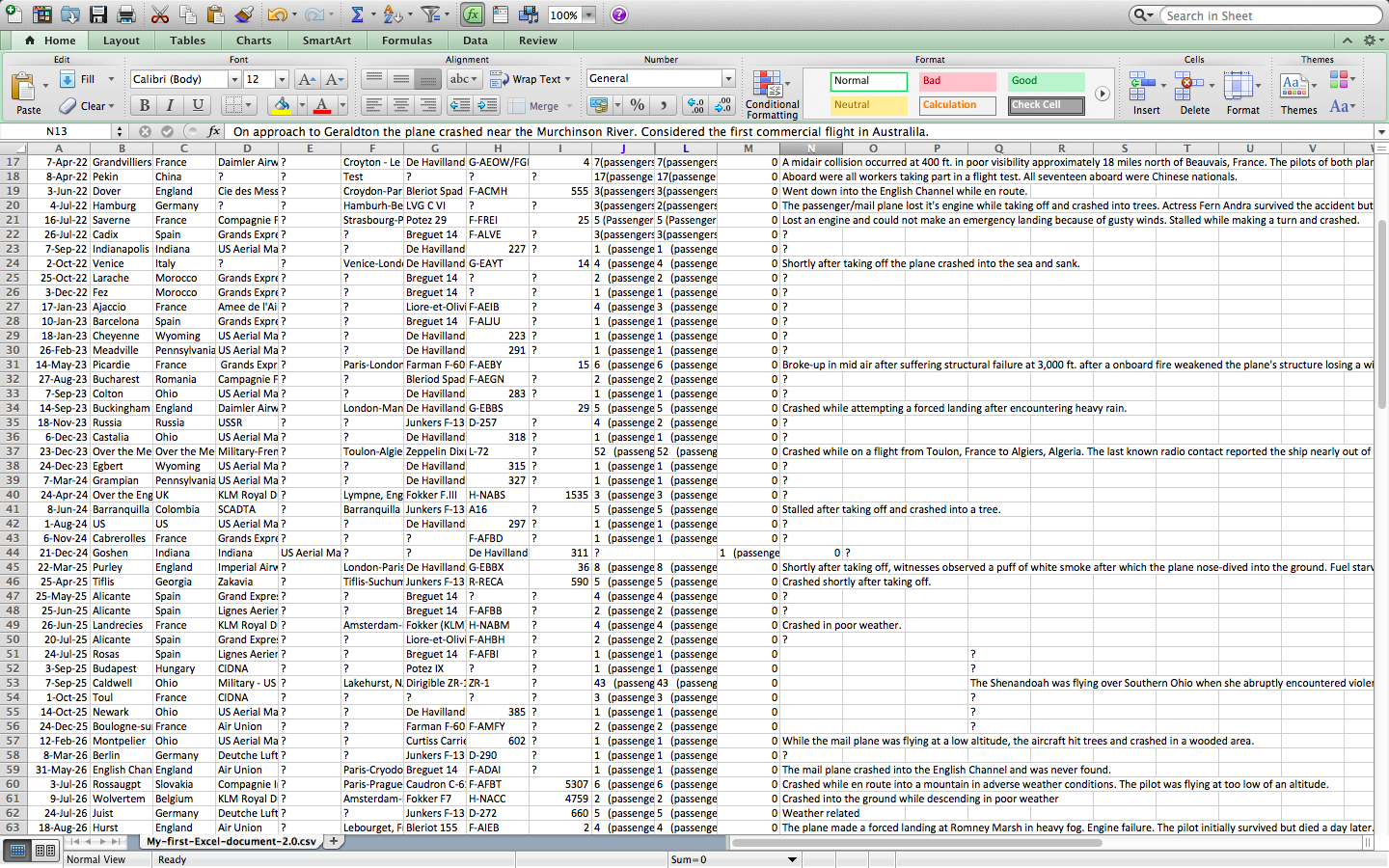
The categories I am working with are

Date:  Date of accident,  in the format – January 01, 2001
Time:  Local time, in 24 hr. format unless otherwise specified
Airline/Op:  Airline or operator of the aircraft
Flight #:  Flight number assigned by the aircraft operator
Route:  Complete or partial route flown prior to the accident
AC Type:  Aircraft type
Reg:  ICAO registration of the aircraft
cn / ln:  Construction or serial number / Line or fuselage number
Aboard:  Total aboard (passengers / crew)
Fatalities:  Total fatalities aboard (passengers / crew)
Ground:  Total killed on the ground
Summary:  Brief description of the accident and cause if known

At this moment, I do not have enough data to make any conclusions, but questions have already started to arise. For example, is there a connection between the aircraft type and the number of accidents? De Havilland, Fokker, and KLM seem the most popular for now.

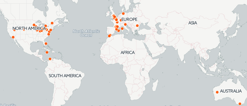
To better understand my data, I chose Carto DB as my tool. In the near future I should be able to see in what part of the world the most airplane accidents happened. For now, my map looks like this

Screen Shot 2015-11-29 at 10.49.39 PM

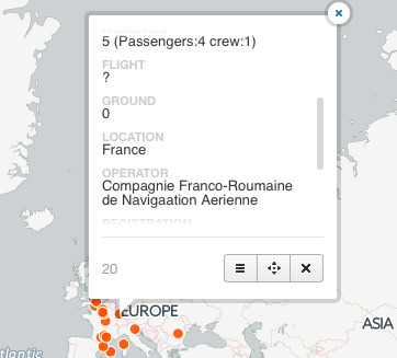
When clicked on a dot info about the accident appears

Screen Shot 2015-11-29 at 10.57.34 PMI

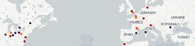
Ideally, I would like to have every ten years appear in different colors on the map. This kind of visualization should provide a deeper insight in my data.

Screen Shot 2015-11-29 at 11.08.16 PM

Problems Encountered

I knew that Carto DB mostly recognized large cities. Surprisingly, it is sometimes able to find towns, too. So how do you georeference something that did not appear on the map? You need to go to the map’s data and look for what exactly did not show up. Then, go back to the map and search for the town you were looking for. At the bottom of the menu there is an “add” feature. Click it and click twice at the location you need. You can enter data manually. This is how I dealt with the little towns situation. When a plane accident over Gibraltar had to be georeferenced, I simply clicked twice on the map at the approximate location of the catastrophe. A new dot appeared and I entered the details manually.

Sometimes Carto DB is wrong. Spring Rocks Wyoming is in the USA, not Jamaica. A few other dots proved wrong, too. Do not know how to deal with this yet. Will ask digital fellows for advise.

Only three lawyers are available on Carto DB. It appears you have to pay for the rest. Good Destry told us about the two free tryout weeks:).

I have 85 years of data. In the first 8 years out of 122 accidents 24 did not get georeferenced. The amount of those in 85 years will be overwhelming. To enter all that data manually would take forever. I wonder if I could leave my map a little imperfect… Something worth asking our professors.

In general, it was rather interesting to research aviation accidents data. Now I know most tragedies happen due to bad weather. Conclusion: never complain about plane delays in winter!

May we stay safe, and may there be less tragedies in the world.

Airplane Crash Info

At Github I came across a dataset about plane crashes. Even though it is not something I am passionate about (in fact, I hope to not think too much about it while flying next time), the data raised my curiosity. At Accident Database they provide information about airplane accidents since 1921 till 2015. I was not sure how to verify this data. What I did was selecting a few random plane crashes and looking them up online. It worked, those calamities really happened.

It is hard to predict what questions I will be able to ask and answer once my data is ready to use. They say, the more you work on it the more correlations you see. For now, I have noticed that the number of airplane accidents during in 1945 does not differ much from from the one in 1957. Looking at the data closer revealed that almost all the airplane crashes documented in 1945 happened to the military planes, which means the regular ones weren’t flying because of World War II. Actually, my data set provides info on military plane crashes with more than 10 people aboard. One can only imagine how many small airplanes were destroyed.

With this being said, l am going back to working on my slides.

May we stay safe!


New Data Set

Hi everyone. As you know, I was going to work on the Indian boarding schools project. Unfortunately, I was not able to find data. All the people/libraries/organizations I contacted were very responsive, but regrettably, the information they provided was scarce. It turned out, I could not work on this project, because there was NO data to use/rely on. I have watched videos where Native Americans express their frustration about being the third generation of boarding school raised people, so I presumed that maybe I could track down at least a few families, but even that was not feasible. This kind of information is private. Do not misunderstand me, the information I need exists, but I would have to go to Washington DC to obtain it (most likely, no one even comprised it into a data set yet). I honestly did not expect this turn of events. To fight back frustration, I started to look for ideas in other people’s posts. That is how I learned Kat Vecchio found her data set on Github. So, I started browsing.

To be continued


Native American Boarding Schools

At my other class we read Report of the Maine Wabanaki-State Child Welfare Truth & Reconciliation Commission. That is how I found out that the little Native Americans in Maine are 5.1 times as likely to go to foster care than the non-native children. The Native Americans see it as the continuation of the genocide they have experienced from the Europeans. To them, foster care is a sequel to the Indian boarding schools.

Having come from a different part of the world I knew some common facts about Native Americans, but I did not know anything about their boarding schools. The latter were created to deal with “the Indian question”. Captain Richard H. Pratt established the first boarding school in Pennsylvania in 1879 with hope to “kill the Indian and save the man”. Europeans thought that if they teach the native children their ways (like religion, team sports, the notion of private property) and give them some education, there would be no need in eradicating the race. The main goal of the Indian schools was to assimilate the Natives with their Caucasian neighbors. It was done in the most hurtful ways. Children as young as six had to adapt to a new way of life: their hair was cut, clothes burnt, native language prohibited. At a boarding school everyone had to wear uniforms, accustom to a very rigid schedule, and speak English. For any kind of misbehavior the Indian children were severely punished. Physical and even sexual abuse was a rather frequent phenomenon in the Native American boarding schools. Since boarding schools for Indian kids were mandatory, the approximate number of their students reached 60000 in 1973. This leads us to believe almost every Indian family was impacted by the system. The mistreated students of the Native American boarding schools carried pain and resentment into their adulthood, which often resulted in substance abuse and poor parenting skills.

The truth commissions are created for those who need reconciliation. Having openly discussed their negative experiences, adults are trying to forgive the system and possibly become better parents to their kids. A loss of a child to foster care is a parent’s personal tragedy. For Native Americans it is also a tribal catastrophe, since their communities are too small and risk extinction without progeny. Everyone makes mistakes, and the Native Americans have as much rights for their children as any other racial group.

For my project, I would like to tell this story in a digital way. I plan on making some introduction about the purpose of the Indian boarding schools and illustrate the narrative with pictures. Then, I would like to use Neatline to map the schools across the States. When clicked on a certain school, a short history of it has to show up. To make it more complex, photographs of schools will be presented. Since there were about one hundred Indian boarding schools in the US, it is too big of an undertaking to map and describe all of them. Therefore, I will concentrate on the biggest or the most famous ones. The project should be accompanied with the Trail of Tears music at the background. If time permits, the project will develop with a narrative of Native American revival: schools, festivals, and modern culture. With happy Indian music, of course.

I am not sure about the data I will draw the information from. So far I have not found any collective sources I hoped to come across while doing research. It is possible I will be looking up every school separately and using my Zotero account to cite the sources.

Suggestions and any kind of help are highly appreciated:).

Wind Map

The Wind Map, mentioned by Professor Klein during her speech The Long Arc of Visual Display caught my attention. You can check out how the winds move across the United States at http://hint.fm/wind/ . Since the Professor alluded to it very briefly, I decided to find out what the map was for. It turns out, Wind Map is a personal art project of the two leaders of Google’s “Big Picture” visualization team, Martin Wattenberg and Fernanda Viegas (creators of History Flow from our homework). Although Wind Map was designed for purely artistic reasons, people are trying to use it while studying birds migration tendencies, planning bicycle trips, and speculating on chemicals in the atmosphere (?!). This makes me think of Where’s the Beef piece, mentioned by Professor Klein as well. Digital Humanities does not have to answer questions right away; even if its projects seem unhandy at the moment, they might become very practical in future.

For more on Wind Map, go to http://www.bewitched.com/windmap.html .

Highly Recommend

On Wednesday, October 27th, I attended The Lexicon of Digital Humanities workshop. It was great. The fellows, Mary-Catherine and Patrick, were professional, helpful, and, obviously, very knowledgeable in the subject area. What I liked most and did not expect was the interactive atmosphere during the workshop. It is easier to focus in the classroom after a long workday if you are an active participant rather than a passive recipient. During The Lexicon of Digital Humanities we were introduced to a number of tools. Unfortunately, there was not enough time to explore them. Nevertheless, I found it helpful. At the DH seminars we are asked to search for tools and describe them, but it is rather hard to decide what exactly you want to work on having opened DIRT. At the workshop, the fellows showed us what was available and gave us time look into what seemed interesting. That way, I discovered Neatline, a few days before opening the homework page:). Now I am considering it as the essential part of my data project.

The Lexicon of Digital Humanities workshop delivered a huge amount of information in a very short time span to a full classroom of participants. I cannot speak for everybody, but it is unlikely someone felt left out. The digital fellows get A+.

Graphs, Maps, Trees

I am a reader. Not exactly sure what it means by modern standards, but I call myself a reader because I like how books impact my brain. Be it a historical novel or Moretti’s Graphs, Maps, Trees, I savor words selected by the author and connections they create in my mind. Imagination is what I believe has been driving human civilization from the very beginning. To imagine is to be human. By reading, imagination ignites. I have a friend who prefers not to read interesting books while managing multiple projects at work since he knows it keeps his mind distracted to the point he hardly makes it to work. He says he loves to be in a different reality, but books sometimes imprison his brain in a very particular way. My friend confided to me that in his twenties he would sometimes call in sick and simply stay home with his book. It felt good, but also terrified him. Although I have never missed work because of a book, I often do not want to re-emerge from a different reality. The explanation to this phenomenon can be found in Moretti’s chapter three, Trees. Literature, especially novels, evolves and adjusts to the new realities of a certain generation. There is an innumerable variation of books to every person’s liking. If someone misses work because of a book, it means she found the one with the correct embranchment. Moretti’s tree schemes show there is an indefinite number of ramification in novels. If you were never enchanted by a novel you might not have found the right one for yourself yet. But if you did and you are totally immersed in a fictional world, maybe start analyzing why the book engages you this much. I think Maps, Moretti’s second chapter, would be the most helpful in this inquiry. Is it a circular or linear map of fictional reality that makes you want to come back? Having reduced the text to minimum elements, what geometric form arises by creating connections between the characters? Why is it happening and what meaning does it convey to you? Graphs, Maps, Trees provides its readers with an interesting analysis of connections between social/historical situation of a certain timeframe current to it novels, and with an interesting analysis of schemes novels unwittingly produce in human imagination. I think I received some of the answers from Moretti.