Author Archives: Maple Wu

Data Set Project – Graduation Rate in 4 Year Postsecondary Institutions

My data set project turned out a lot different from what I envisioned. I found my data from the Integrated Postsecondary Education Data System (IPEDS). They have a Trend Generator System, which easily helps you generate data, and you can see how this data changed over time. So, I looked at the percentage of bachelor students who graduated within 150% normal time (6 years) at 4 year postsecondary institutions in cohort year 2007. I broke the data down by state and race/ethnicity.

I wanted to do a mapping of this data to help us visualize these numbers. After seeing what UC Berkley did with their Urban Displacement  project, my goal was to emulate something similar and continue to work on it for the final project. After using CartoDB, it was really not giving me what I wanted. I couldn’t separate the cluster of plotting points. Each layer also acted as an individual layer that didn’t add up with previous data/layers I mapped. For instance, here’s what I got when I added two other layers to the map:

map with points

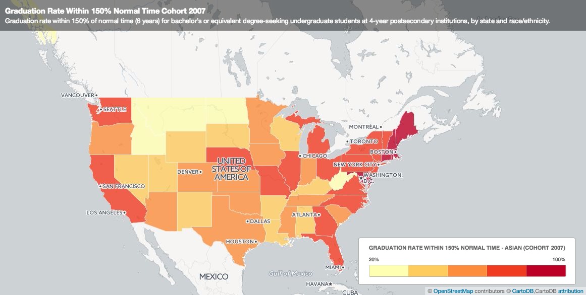
The black and red bubbles aren’t really points…. Then I tried to create another map, a choropleth map. This map shows the different percentage of Asians who graduated at normal time. If you click on each state, a pop-up shows the graduation rate for other race/ethnic groups.

map choropleth

This wasn’t what I wanted at first, but it was what I got. Then I was thinking, is this enough? Do I need an actual map in my visualization? How does this map help me compare my data?  I decided to turn to Plotly just to do some visualization with charts. Here was what I came up with:

A three y-axes graph:

Screen Shot 2015-11-29 at 11.01.31 PM

A scatter plot:

Screen Shot 2015-11-29 at 11.07.30 PM

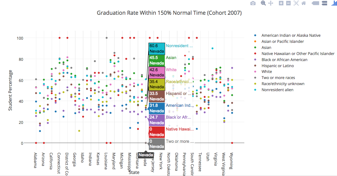
Even with these two charts, there’s still limitations to visually seeing the data. I’m hoping that in the next couple of weeks, I’ll either find a tool that matches with what I want or I’ll try to manipulate my data more and see what I get.

WordPress II Workshop

I went to the WordPress II Workshop last night. The workshop was helpful in assisting me refresh some of the things I’ve learned about WordPress in the past. A couple of things we gone over included: Categories, custom menus, pages vs. posts, widgets, plugins, and CSS. I thought the CSS aspect was really interesting. And I’m planning to attend the Advanced WordPress Workshop next Monday to learn more about it.

Happy Thanksgiving everyone!

-Maple

Dataset Project – Asian Americans and Graduation Rate in Postsecondary Ed

After some more digging, I’ve decided to throw away the Casino Buses and Homelessness in Flushing, Queens project. Instead, here’s my new new proposal:

The National Center for Education Statistics (NCES) is a federal entity that collects, analyze, and reports data related to education in the U.S. and other nations. One of their major programs is the Integrated Postsecondary Education Data System (IPEDS), a single, comprehensive system that provides data from the nation’s 9,800 public and private postsecondary institutions. Data includes: Special studies of students, financial aid, postsecondary faculty, and bachelor’s degree recipients, doctoral degree recipients, transcript studies, and various longitudinal studies.

I will be looking at data on longitudinal studies about Asian American students and graduation rate at postsecondary institutions by state / geography. Some questions I hope to address:      

  1. What are the  percentage / number of Asian / Asian or Pacific Islander students who graduated within 6 years of their studies by state / geography?
  2. How do these data change over the course of the years?
  3. How do these data compare with other race/ethnic groups?
  4. How does gender (male/female) change the outlook of the dataset?

I plan to test out various mapping and data visualization tools and see how my dataset plays out.

-Maple

Social Justice and the Digital Humanities

Hey all,

Just ran across a site that might be of interest to those interested in postcolonial, or more generally, social justice approaches to DH. Social Justice and the Digital Humanities is a site that emerged from one of the courses at HILT 2015 (Humanities Intensive Learning and Teaching). The three-day intensive course combined theory and praxis, similar to our class. Discussions included questions about: access, material conditions, method, ontologies and epistemologies. I like that much of the content are questions, followed by further readings/references. It also included a list of DH projects with a social justice approach in mind.

One project I thought was pretty cool is Map of Native American Tribes . Aron Carapella, a self-taught mapmaker, mapped out original names and locations of native american tribes before their contact with Europeans. This transformed the entire makeup of how we visualize the map of the United States.

I also found out about #transformdh, “an academic guerrilla movement seeking to (re)define capital-letter Digital Humanities as a force for transformative scholarship by collecting, sharing, and highlighting projects that push at its boundaries and work for social justice, accessibility, and inclusion”

-Maple

Relavent Readings For This Week

Hi All,

Here’s two articles relevant to some of our class discussions thus far. The first, Five Ideas for Digital Labor History, is a short piece by Tobias Higbie, Associate Professor in History at UCLA, in which he presents five ideas that labor historians can engage with DH. The second article, Laboring Wikipedia, follows up on Higbie’s use of Wikipedia as a class project for students to engage and collaborate in course materials. As a final class project that replaces the traditional term paper, students from his upper division labor history lecture create/edit Wikipedia entries on topics relevant to the class. Some things he highlights included project process, student experience, and future changes.

-Maple