My data set project turned into an exercise in parsing and cleaning data before all else. I knew that I wanted to look into the current climate of sexual assault on college and university campuses, but there were a number of places to look for data on the issue. I landed on the Report on the Association of American Universities Campus Climate Survey on Sexual Assault and Sexual Misconduct. This report was the most recent, had the most immediately accessible data, and had been widely publicized when it was released earlier this fall. (See, for example, the NYTimes’s September article, “1 in 4 Women Experience Sex Assault on Campus.“) I contacted the AAU and made multiple attempts to access the original survey results, but in the end had to resort to the data tables as they appeared in the report.
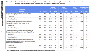
This data table is where I began — with the percent of students experiencing different forms of nonconsensual sexual contact, organized according to their gender.
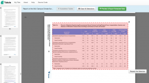
I then used the web software Tabula to scrape the data from the .pdf…
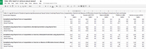
…cleaned and exported to Google Sheets…
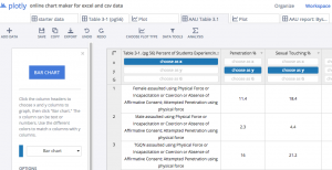
…and cleaned and imported into Plotly.
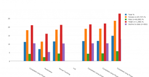
At every step of the way I was reorganizing the data to focus on the story that I most wanted. When I first started graphing, the data looked like this:
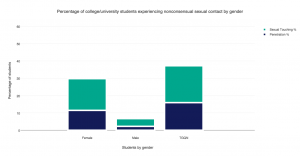
Until I continued to manipulate it to get it to look like this:
This exercise speaks to the amount of parsing, cleaning, selection, and editing that is necessary to arrive at even the simplest of bar charts. But I appreciate it for the new pieces of information that emerge from analyzing data through this process. For example, consider the high percentage of TGQN (that’s transgender women, transgender men, genderqueer, gender non-conforming, and questioning students, and those whose gender wasn’t listed) that are experiencing some form of assault on their campuses. Most media coverage of this issue has focused on the victimization of female students, but apparently there’s also a critical story here about the safety of TGQN students — something that I didn’t realize until I went through the motions of visualizing the data, and that probably a lot of other people are missing too.
As far as Plotly as a tool for visualization, I found it to be relatively easy to use, especially for someone who doesn’t know how to code. But I prefer Highcharts for the greater autonomy and flexibility it allows the user. That said, Highcharts is a JavaScript library, and as such requires some degree of JS knowledge to manipulate. For anyone who wants to churn out a pretty quick, pretty attractive, and very shareable graph, I think Plotly is a good choice.


Thanks for this post, Destry! Excellent to see your process here.