Category Archives: Uncategorized

Data Set for project

Hi all

As a historian, I study the US Civil War quite closely. One of the recurring themes I’ve noticed while reading primary source accounts is the role that sound plays in describing the war. While soldiers, observers, civilians, etc. all describe what they see regularly, I notice that sound is incredibly important to these writers and often most poetically described.

I would like to use electronic databases which catalog diaries and newspapers from the Civil War era as my data set to get at sound’s importance to the experience of the war. I will use The American Civil War: Letters and DiariesIllustrated Civil War Newspapers and Magazines, and the Nineteenth Century Masterfile.

Many thanks,

Dave Campmier

Data Project: Reading Transnationalism and Mapping “In the Country”

Last week, we discussed “thick mapping” in class using the Todd Presner readings from HyperCities: Thick Mapping in the Digital Humanities, segueing briefly into the topic of cultural production and power within transnational and postcolonial studies (Presner 52). I am interested in what the investigation of cultural layers in a novel can reveal about the narrative, or, in the case of my possible data set, In the Country: Stories by Mia Alvar, a shared narrative among a collection of short stories, each dealing specifically with transnational Filipino characters, their unique circumstances, and the historical contexts surrounding these narratives.

In the Country contains stories of Filipinos in the Philippines, the U.S., and the Middle East, some characters traveling across the world and coming back. For many Overseas Filipino Workers (OFWs), the expectation when working abroad is that you will return home permanently upon the end of a work contract or retirement. But the reality is that many Filipinos become citizens of and start families in the countries that they migrate to, sending home remittances or money transfers and only returning to the Philippines when it is affordable. The creation of communities and identities within the vast Filipino diaspora is a historical narrative worth examining and has been a driving force behind my research.

For my data set project, I hope to begin by looking at two or more chapters from In the Country and comparing themes and structures using Python and/or MALLET. The transnational aspect of these short stories, which take place in locations that span the globe, adds another possible layer of spatial analysis that could be explored using a mapping tool such as Neatline. My current task is creating the data set – if I need to convert it, I could possibly use Calibre.

Wind Map

The Wind Map, mentioned by Professor Klein during her speech The Long Arc of Visual Display caught my attention. You can check out how the winds move across the United States at http://hint.fm/wind/ . Since the Professor alluded to it very briefly, I decided to find out what the map was for. It turns out, Wind Map is a personal art project of the two leaders of Google’s “Big Picture” visualization team, Martin Wattenberg and Fernanda Viegas (creators of History Flow from our homework). Although Wind Map was designed for purely artistic reasons, people are trying to use it while studying birds migration tendencies, planning bicycle trips, and speculating on chemicals in the atmosphere (?!). This makes me think of Where’s the Beef piece, mentioned by Professor Klein as well. Digital Humanities does not have to answer questions right away; even if its projects seem unhandy at the moment, they might become very practical in future.

For more on Wind Map, go to http://www.bewitched.com/windmap.html .

Twitter losing talent/minorities/women because of diversity issues


Workshop – Data Visualization

The data visualization workshop (10/29) was particularly helpful in understanding how data visualization should be approached. Indeed, the digital fellows stressed to importance to think and visualize with our minds before working with data.

Assuming that we already have a particular set of data, it is essential to understand what and how we would like to visualize. Therefore, it is useless to start right away with excel (and it was indeed, interesting how many of us had this impulse of using right away that software but without really knowing what to do).

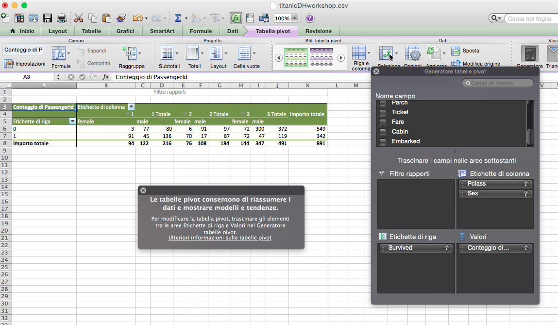
We started with a data set sample providing different information about the Titanic’s passengers (gender, survived, age, name, class, etc.). The following step was the decision of which relationships we wanted to visualize. So, (and this is just an example) we picked a few categories such as survival and class, in order to see their relationship. How did class affect the survival rate?

Then, by using some crayons and a white piece of paper, we tried to imagine and reproduce how we wanted to visualize the questions we asked to our data and their relationship.

Pretty soon the how became the big issue. How does a particular visualization convey certain information? How can we avoid confusion and provide a clear understanding of a particular issue?
So, for instance, we moved quite quickly from the pie diagram to different kind of graphs. The pie does its best when we want to show two things: one independent and one independent, in other words, how much is one thing in percentage to the other thing.
In order to provide a clearer representation of more than two categories we looked for a different kind of visualization.
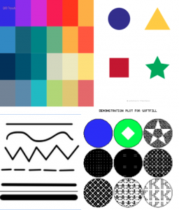
In this process we learned to look carefully at 4 categories that can help us in elaborating different categories and variables in the same visualization:

1) line
2) color
3) shape
4) area/fill

Line_Shape_Color_area

After having chosen the data, and the relationship we wanted to represent, we entered our data in excel. From this point on, we learned to use a powerful excel tool: pivot tables. This function allows users to sort and summarize data according to different criteria. This selection is then represented into a second table. In other words, pivot tables help in understanding particular realtionships and trends in larger data set.

Pivot tablesFrom this point on, we could use Excel’s previews of different graphs in order to understand which visualization we could use to construct the most effective representation of the relationship we wanted to emphasize.

Finally, the digital fellows suggested us many different softwares paricualry helpful for data visualization:

GUI Based:
– google charts
– tableau

R-ggplot
Python-matplotlib/seaborne/basemap/cartopy
Javascript-D3

Mapping:
GIS-ArcGIS
CartoDB —> change over time

p.s. I’m sorry for the excel picture in Italian 🙂

Dataset Project – Asian Americans and Graduation Rate in Postsecondary Ed

After some more digging, I’ve decided to throw away the Casino Buses and Homelessness in Flushing, Queens project. Instead, here’s my new new proposal:

The National Center for Education Statistics (NCES) is a federal entity that collects, analyze, and reports data related to education in the U.S. and other nations. One of their major programs is the Integrated Postsecondary Education Data System (IPEDS), a single, comprehensive system that provides data from the nation’s 9,800 public and private postsecondary institutions. Data includes: Special studies of students, financial aid, postsecondary faculty, and bachelor’s degree recipients, doctoral degree recipients, transcript studies, and various longitudinal studies.

I will be looking at data on longitudinal studies about Asian American students and graduation rate at postsecondary institutions by state / geography. Some questions I hope to address:      

  1. What are the  percentage / number of Asian / Asian or Pacific Islander students who graduated within 6 years of their studies by state / geography?
  2. How do these data change over the course of the years?
  3. How do these data compare with other race/ethnic groups?
  4. How does gender (male/female) change the outlook of the dataset?

I plan to test out various mapping and data visualization tools and see how my dataset plays out.

-Maple

Pondering my project

I have been pondering how to do my data set project, after going to many various workshops, I have come up with an idea.  I like the fact that we can create maps to explain how and why, of course I will be using maps.  I want to focus on the homeless in NYC, but I had to narrow it down to something that people are unaware of when it comes to the homeless.  In my research I read about homeless tent cities, and believe it or not they do exist in the big apple. However unlike other cities across the US, homeless people in New York have to move around, therefore, unable to keep a community up for very long.  This subject I know is a little depressing, but this story has to be told, by someone, and that someone will be me.

I will be attending a workshop next week titled, “Storytelling with Maps: CartoDB”  I am looking very much forward to this one in particular because I think it will be extremely helpful with my project.


The Lexicon of DH

The Lexicon of DH Slides

I spoke to Mary Catherine Kinniburgh who gave the Lexicon of DH workshop with Patrick Sweeney and asked her if I could post it on our page, and she said it was okay to do so.

As I mentioned in class yesterday, I am a visual person.  I need to see the light at the end of the tunnel to know the where, the what, and mostly the how.  Going to this workshop and the way that Mark Catherine and Patrick gave the workshop, helped myself and other classmates see that light as to how we will be able to prepare our data sets and prepare for our final projects.

On a personal note, it helped me understand the past readings better and also as I was preparing for yesterday’s class, I could understand the readings on mapping with a new visual perspective.  As I read, I thought of what digital tools would I use to do that.  For me, this is progress.

Good luck with your data sets and projects.


GC Digital Fellows workshop on Data Visualization

Tonight’s GC Digital Fellows workshop on data visualization was a great overview of the tools available for making visualizations and the considerations that anyone must take into account when trying to do so. Michael Mandiberg started by walking us through the difference between infographics (made by people) and data visualizations (made by machines). He discussed the importance of balancing content and form, and the different roles that data visualizations can play — be they for rhetoric, education, persuasion, art, or a combination thereof. He reminded us that anytime you are operating in a visual field, you are navigating design problems. He shared readings and videos — Hans Rosling on Google’s Public Data Explorer, Noah Ilinsky’s Designing Data Visualization, David McCandless’s Information is Beautiful, and the “I Like Pretty Graphs” video on Youtube. He also shared data visualization tools — wordle.net and tagxedo.com to make tag clouds; Google Ngrams to track the frequency of keywords in texts through time; Google Public Data Explorer for easy visualizations of publicly available data sets; Gephi for visualizing networks; and D3, an open-source JavaScript library for all kinds of beautiful interactives. (Here’s a list of the best d3.js examples, which he pointed us to.)

His final takeaways for visualizing data: The most important thing is to start by knowing what question you want to ask. Then find the appropriate form to represent and/or answer your question. Keep in mind that the entire enterprise of your data and software is rooted in a context, form, and ideology. But that said, with data visualization you can learn some really cool stuff.

With all of these tools, resources, and examples, the workshop repeatedly returned to pedagogical applications. For example, we explored representations of keywords in presidents’ State of the Union Addresses from various points through US History. These keywords were visualized in an optometrist’s list, with the most frequently appearing words located in the “E” spot. We agreed that these posters would be useful tools to generate discussion about changing trends through American history — for example, what does it tell us that Lincoln’s most prominent word was “Emancipation” and George W. Bush’s was “Terror”?

It’s just one example, but really there are countless applications of data visualization for the classroom.


Plot Mapping abstract literature

I’ve been thinking all week about our discussion in class last Monday, regarding the usefulness of topic modeling software, and how the results can be pretty misleading depending on what your aiming is in using it. I’ve been thinking about turning this plot mapping software on essentially chaotic or even “plotless” novels (specifically the works of Thomas Pynchon)—what would that look like? Would it actually illuminate anything? What would turning any of these mapping or modeling tools on Pynchon, a writer who doesn’t esteem plot as an important element of his writing, do for our understanding of his work? Would topic modeling help make his abstract work more accessible? Would “word bag” approach help us understand more abstract literature that doesn’t rely on standard elements we’ve come to expect (such as a linear plot)?