Data Project: Reading Transnationalism and Mapping “In the Country”

Last week, we discussed “thick mapping” in class using the Todd Presner readings from HyperCities: Thick Mapping in the Digital Humanities, segueing briefly into the topic of cultural production and power within transnational and postcolonial studies (Presner 52). I am interested in what the investigation of cultural layers in a novel can reveal about the narrative, or, in the case of my possible data set, In the Country: Stories by Mia Alvar, a shared narrative among a collection of short stories, each dealing specifically with transnational Filipino characters, their unique circumstances, and the historical contexts surrounding these narratives.

In the Country contains stories of Filipinos in the Philippines, the U.S., and the Middle East, some characters traveling across the world and coming back. For many Overseas Filipino Workers (OFWs), the expectation when working abroad is that you will return home permanently upon the end of a work contract or retirement. But the reality is that many Filipinos become citizens of and start families in the countries that they migrate to, sending home remittances or money transfers and only returning to the Philippines when it is affordable. The creation of communities and identities within the vast Filipino diaspora is a historical narrative worth examining and has been a driving force behind my research.

For my data set project, I hope to begin by looking at two or more chapters from In the Country and comparing themes and structures using Python and/or MALLET. The transnational aspect of these short stories, which take place in locations that span the globe, adds another possible layer of spatial analysis that could be explored using a mapping tool such as Neatline. My current task is creating the data set – if I need to convert it, I could possibly use Calibre.

Wind Map

The Wind Map, mentioned by Professor Klein during her speech The Long Arc of Visual Display caught my attention. You can check out how the winds move across the United States at http://hint.fm/wind/ . Since the Professor alluded to it very briefly, I decided to find out what the map was for. It turns out, Wind Map is a personal art project of the two leaders of Google’s “Big Picture” visualization team, Martin Wattenberg and Fernanda Viegas (creators of History Flow from our homework). Although Wind Map was designed for purely artistic reasons, people are trying to use it while studying birds migration tendencies, planning bicycle trips, and speculating on chemicals in the atmosphere (?!). This makes me think of Where’s the Beef piece, mentioned by Professor Klein as well. Digital Humanities does not have to answer questions right away; even if its projects seem unhandy at the moment, they might become very practical in future.

For more on Wind Map, go to http://www.bewitched.com/windmap.html .

Twitter losing talent/minorities/women because of diversity issues


On reading

Several things stood out for me from Stephen Ramsay’s essay “The Hermeneutics of Screwing Around; or What You Do with a Million Books.” The most significant of them was the fascination with where is the anxiety to read everything coming from. Ramsay says it started in the 15th century, around the time of the introduction of the Gutenberg press to Europe. Since then, there have been many philosophers who agonized over the ever-growing number of books that they could not possibly read. Referencing Margaret Cohen and what she calls “the great unread,” Ramsay pokes fun at the way we talk about the literary canon and its supposed inclusivity and representation of the field: “But in the end, arguments from the standpoint of popularity satisfy neither the canoniclast nor the historian. The dark fear is that no one can really say what is “representative” because no one has any basis for making such a claim.”

Ramsay proposes different options. He quotes Martin Mueller and his suggestion to “stop reading” once you’ve identified the location of the book in the network of transactions “that involve a reader, his interlocutors, and a ‘collective library’ of things one knows or is supposed to know.” Responding to Mueller’s quote, I jotted down in bright blue pen “but don’t you miss nuance!?” On my second reading of Ramsay’s essay, I noted, “What is the point of reading—is it to just locate the book in the network of transactions and to talk about it to others or is it to learn and enjoy?” Is intricate detail of a human story of any interest to us when we read only up to the point of locating the books in its network of transactions? For example, once we learn that the lead character Sally has favorable chances of hooking up with her object of affection Mary, then should we just stop reading?

Another option is to read books from compilations such as “Top 100 novels of all time.” And although the feasibility of canon is questionable, many do follow these lists as a way to combat this anxiety of missing out. So much so, that NPR run a story titled “You Can’t Possibly Read It All, So Stop Trying” where the guest Linda Holmes recommended strategies and coping techniques. But I have a question. Whom do we regard as authority over what makes it on the canon? In class, a colleague bought up that editors do the sorting for us when they accept or refuse manuscripts. But who are the editors and what are their standpoints and biases? Following the network associations, are the manuscripts closest to culturally dominant network of transactions more likely to become books?

Yet another option is Franco Moretti’s approach to simultaneous reading of thousands of novels assisted by computer technology. Except that there won’t be reading per se, but counting, graphing, and mapping. Since we cannot read even a fraction of all the books out there, why not analyze them and see what stands out? Matthew Jokers also came up with a way to identify “six, or possibly seven, archetypal plot shapes.” Although his methods were questioned on the public forum, his laborious attempt at condensing thousands of novels into six or seven plotlines demonstrates the strength of desire for reading it all. I wonder, are these questions being brought up by folks who have been around prior to ubiquity of computers and actually read many books cover to cover, so now they don’t mind missing out on the nuance?

Then again, why is there so much anxiety over reading it all? The shame of being “caught unaware” of a book’s plot while mingling over wine and hors-d’oeuvres? Because if it was to achieve a shared knowledgebase for meaningful participation on the public square, then wouldn’t reading the books in K-12 and college be sufficient? Nowadays it seems most of our knowledge comes in the form of visual media or lists of top things curated by BuzzFeed or our Facebook network.

Ramsay eloquently concludes, “Your ethical obligation is neither to read them all nor to pretend that you have read them all….” but to appreciate the process of discovery. Agreed!

Workshop – Data Visualization

The data visualization workshop (10/29) was particularly helpful in understanding how data visualization should be approached. Indeed, the digital fellows stressed to importance to think and visualize with our minds before working with data.

Assuming that we already have a particular set of data, it is essential to understand what and how we would like to visualize. Therefore, it is useless to start right away with excel (and it was indeed, interesting how many of us had this impulse of using right away that software but without really knowing what to do).

We started with a data set sample providing different information about the Titanic’s passengers (gender, survived, age, name, class, etc.). The following step was the decision of which relationships we wanted to visualize. So, (and this is just an example) we picked a few categories such as survival and class, in order to see their relationship. How did class affect the survival rate?

Then, by using some crayons and a white piece of paper, we tried to imagine and reproduce how we wanted to visualize the questions we asked to our data and their relationship.

Pretty soon the how became the big issue. How does a particular visualization convey certain information? How can we avoid confusion and provide a clear understanding of a particular issue?
So, for instance, we moved quite quickly from the pie diagram to different kind of graphs. The pie does its best when we want to show two things: one independent and one independent, in other words, how much is one thing in percentage to the other thing.
In order to provide a clearer representation of more than two categories we looked for a different kind of visualization.
In this process we learned to look carefully at 4 categories that can help us in elaborating different categories and variables in the same visualization:

1) line
2) color
3) shape
4) area/fill

Line_Shape_Color_area

After having chosen the data, and the relationship we wanted to represent, we entered our data in excel. From this point on, we learned to use a powerful excel tool: pivot tables. This function allows users to sort and summarize data according to different criteria. This selection is then represented into a second table. In other words, pivot tables help in understanding particular realtionships and trends in larger data set.

Pivot tablesFrom this point on, we could use Excel’s previews of different graphs in order to understand which visualization we could use to construct the most effective representation of the relationship we wanted to emphasize.

Finally, the digital fellows suggested us many different softwares paricualry helpful for data visualization:

GUI Based:
– google charts
– tableau

R-ggplot
Python-matplotlib/seaborne/basemap/cartopy
Javascript-D3

Mapping:
GIS-ArcGIS
CartoDB —> change over time

p.s. I’m sorry for the excel picture in Italian 🙂

Dataset Project – Asian Americans and Graduation Rate in Postsecondary Ed

After some more digging, I’ve decided to throw away the Casino Buses and Homelessness in Flushing, Queens project. Instead, here’s my new new proposal:

The National Center for Education Statistics (NCES) is a federal entity that collects, analyze, and reports data related to education in the U.S. and other nations. One of their major programs is the Integrated Postsecondary Education Data System (IPEDS), a single, comprehensive system that provides data from the nation’s 9,800 public and private postsecondary institutions. Data includes: Special studies of students, financial aid, postsecondary faculty, and bachelor’s degree recipients, doctoral degree recipients, transcript studies, and various longitudinal studies.

I will be looking at data on longitudinal studies about Asian American students and graduation rate at postsecondary institutions by state / geography. Some questions I hope to address:      

  1. What are the  percentage / number of Asian / Asian or Pacific Islander students who graduated within 6 years of their studies by state / geography?
  2. How do these data change over the course of the years?
  3. How do these data compare with other race/ethnic groups?
  4. How does gender (male/female) change the outlook of the dataset?

I plan to test out various mapping and data visualization tools and see how my dataset plays out.

-Maple

Digital Dorothy

As I described in the last class, I’m going to use a data set that is a text.  At first, I wanted to create a “diachronic” map of a particular place—the English Lake District—which is a popular destination for hikers, walkers, photographers, and Romantic literature enthusiasts. This last category also includes a great many Japanese tourists.

My first plan was to create a corpus of 18th– and 19th-century poetry and prose related to the Lake District (read: dead white males), explore the way landscape was treated, map locations mentioned in these texts or create a timeline, and then add excerpts of text along with the present-day visual data.

For the present-day component, I was thinking about how to scrape and incorporate data and photos from Flickr and Twitter that were tagged with the names of local landmarks and landscape features of the area.

mapping the lakes image in Google Earth

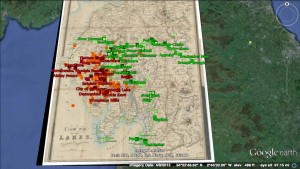
An image from Mapping the Lakes in Google Earth

Early on, I discovered Mapping the Lakes – a 2007-2008 project (apparently still in pilot phase) at the University of Lancaster that uses very similar strategies to explore constellations of spatial imagination, creativity, writing, and movement in the very same landscape. From the pilot project:

The ‘Mapping the Lakes’ project website begins to demonstrate how GIS technology can be used to map out writerly movement through space. The site also highlights the critical potentiality of comparative digital cartographies. There is a need, however, to test the imaginative and conceptual possibilities of a literary GIS: there is a need to explore the usefulness of qualitative mappings of literary texts… digital space allows the literary cartographer to highlight the ways in which different writers have, across time, articulated a range of emotional responses to particular locations … we are seeking to explore the cartographical representation of subjective geographies through the creation of ‘mood maps’.

The interactive maps are built on Google Earth; therefore, don’t try to view this in Chrome. You can also use the desktop version of Google Earth. The project is quite instructive in its aims as well as its faults and failures, and the process and outcomes are described on the website. (Actually, the pilot project might be a very good object lesson on mapping creative expression with GIS.)

However, if you’re interested in this kind of mapping, you should take a look at the Lancaster team’s award-winning research presentation poster on their expanded Lakes project:

I wrote to one of the authors to ask her about it—methodology, data set, etc. She was happy to respond, and was encouraging. Although the methodology is way beyond my technical chops at present, she referred me to a helpful semantic text-tagging resource that they used, and I’m sure will come in handy at some point.

After some floundering around, I defined a data set and project that is challenging but more manageable. It will involve a map and one text: an excerpt of Dorothy Wordsworth’s journals, from 1801-1803— not long after the second edition of Lyrical Ballads was published, and she and her brother moved to the area with their friend Samuel Taylor Coleridge.

The journals are a counterpoint to William Wordsworth’s early poetry, in that she kept them as much for her brother as for herself—recording experiences they had together, and personal observations that she knew would inspire him—to provide the raw material for his poems. There is a not extensive yet established amount of scholarship on the subject. She even describes this collaborative process in her journal—although it’s not called collaboration, and until more recently wasn’t characterized as such by critics.

To prepare the data set, I downloaded the text file of the most complete edition of her journals from Project Gutenberg, took out everything not related to this time period, and did a lot of “find and replace” work to get rid of extra spaces and characters, editorial footnotes, standardize some spellings, and change initials to full names. Following the advisories on the semantic tagging and corpus analysis sites, I also saved the file in both ASCII and UTF-8 text formats, with line breaks. (This may or may not prove necessary, depending on the tools I use later on). I have considered using a concordance tool of some kind (like Antconc) to visualize those connections, since I don’t think that has been done. However, this would entail creating a second data set with the book of poems and it’s a secondary interest.

My primary goals are these:

  • I’m hoping this project will confirm or complicate existing assumptions about Dorothy and her journals, which until now—as far as I know—have only been developed through close reading, not visualization.
  • Using this text, I want to map her life in the Lake District during this period – socially, physically, and emotionally. (In her brother’s case, his poetry does a good job of that, and stacks of books have been written about his relationships to other people, women, landscape, time, etc.)
  • I want the map to be interactive to some degree, so that users can trace these different aspects of her life geographically, by clicking on related keywords. Ideally, I would like to include supplementary images—paintings, engravings, and portraits—that were created in the era, to provide a contemporaneous visual component. Including related excerpts of journal or poetic text would also be helpful: it would be a means of mapping her creativity, in a way. A similar map of  William Wordsworth‘s creativity exists. It is more extensive but not very user-friendly.

On the cartographical front, I have been considering CartoDB and Mapbox. I also looked at the British Ordnance Survey topographical map of the area, which, like all the ordnance maps, is now online. The OS website includes a feature similar to Google maps, whereby you can personalize maps to some degree, and connect text and image data. Of course, Google Earth can be used this way too. Mapbox has nice backgrounds, but less options. CartoDB is visually pleasing,  versatile, and allows for more elegant “pop ups,” which I could use to include bits of text, images from the time, etc. But it can’t be embedded into a webpage. As they come into focus, the project goals will ultimately determine what I use.

In the meantime, I’m using Voyant to explore the text/data set. It is a great resource to help you define the parameters for a more focused project. You can see what I’m working with here. Eventually I will geocode the locations, either by hand or via Google Maps, input location data, temporal data, and data about her social interactions (all in the text) in a CSV file that can be uploaded into a mapping program, and figure out how to connect everything . (Or I will die trying.) I also plan to study the new and improved “Mapping the Lakes” project more carefully, for ideas on how best to present my own, less ambitious project.

Along the way I’ve encountered some other software that may be useful for those of us who like working with olde bookes: VARD is a spelling normalization program for historic corpora (also from Lancaster U. It requires permission to download but that is easy to get).

That is all.

Pondering my project

I have been pondering how to do my data set project, after going to many various workshops, I have come up with an idea.  I like the fact that we can create maps to explain how and why, of course I will be using maps.  I want to focus on the homeless in NYC, but I had to narrow it down to something that people are unaware of when it comes to the homeless.  In my research I read about homeless tent cities, and believe it or not they do exist in the big apple. However unlike other cities across the US, homeless people in New York have to move around, therefore, unable to keep a community up for very long.  This subject I know is a little depressing, but this story has to be told, by someone, and that someone will be me.

I will be attending a workshop next week titled, “Storytelling with Maps: CartoDB”  I am looking very much forward to this one in particular because I think it will be extremely helpful with my project.


Data Project: Using CartoDB (possibly)

I talked to one of the Digital Fellows and clarified what Web Scraping was. I’m not doing the project I posted. I couldn’t understand how the entire Internet could be scraped by anything, but now I understand that it’s only whatever webpages I select. This won’t do. I will get no real information out of it.

I have come up with another project, though: mapping Greco-Roman libraries. This would be something that I could use in my own research. I have already registered for the Storytelling with Maps class, and it sounds exciting. I’m interested to see what I can do with CartoDB. If the software is robust enough, I can use the map as a complement to my current research, and expand it in the future.

I have a list of 20 or so ancient libraries that need to be plotted on a map of the Mediterranean world. It would be useful to have this type of map to refer to when I’m working online.

Data Project: AAU Campus Survey on Sexual Assault and Misconduct

In September, the Association of American Universities published a widely-publicized survey on sexual assault and misconduct on college campuses. Here is the survey overview:

“The primary goal of the Campus Climate Survey on Sexual Assault and Sexual Misconduct was to provide participating institutions of higher education with information to inform policies to prevent and respond to sexual assault and misconduct. The survey was designed to assess the incidence, prevalence and characteristics of incidents of sexual assault and misconduct. It also assessed the overall climate of the campus with respect to perceptions of risk, knowledge of resources available to victims and perceived reactions to an incident of sexual assault or misconduct.”

For my data project, I’m interested in scraping data tables from the report (only available in .pdf), and then playing with analysis and visualization of them. This is both a chance for me to learn more about the data collected through this survey — data I’m interested in anyway — and an opportunity to play with software and programs that I’ve wanted to try out. R is an example, as well as some visualization programs that I haven’t used before. I might try scraping through Python. And I think it could be interesting to try to apply MALLET to the report in its entirety.

I’m curious if visualizing the data in different ways presents findings that are at all inconsistent with the official findings of the report. Or if new renderings of this data give rise to different research questions for campus surveys in the future. I’m also open to other ideas for exploring the data if you have them!