Hi All,
Sample project proposals have now been uploaded to our private course group in the Assignments folder: https://commons.gc.cuny.edu/groups/digital-praxis-seminar-2015-2016/documents/?category=362537
Hi All,
Sample project proposals have now been uploaded to our private course group in the Assignments folder: https://commons.gc.cuny.edu/groups/digital-praxis-seminar-2015-2016/documents/?category=362537
A few weeks ago I was fortunate to be able to attend an all-day GIS workshop offered by Frank Connolly, the Geospatial Data Librarian at Baruch College. It was very thorough and by the end everyone had finished a simple chloropleth map. For those of you interested in continuing with map-related DH and can spare a friday, I recommend the workshop, which is free and offered several times a semester.
Most professional GIS projects use ArcGIS, made by ESRI, and many institutions subscribe to it to support their GIS projects. It’s not cheap. But, (yay!) there is an open-source alternative called QGIS, which anyone can download. This is the software we used in the workshop. QGIS is far more versatile than CartoDB, but it also has a complex interface and a steep learning curve.
In the workshop, we covered the pros and cons of various map projections (similar to some of our readings) and different types of map shapefiles (background map images); GPS coordinates vs. standard latitude/longitude (sometimes they differ) ;how to geo-rectify old maps so that they line up with modern maps and geocoordinates; open data sources; and how to organize and add information to a QGIS datababse.
The entire workshop tutorial, which participants took home, is available on the Baruch library website. If you’re comfortable learning complicated software on your own, it’s a great resource. Personally, I would need to spend a lot more time working with QGIS, with someone looking over my shoulder, to get a feel for the program. But practicing with the manual over the winter break will be on my ever-growing “to-do” list.
Did anyone end up at the Critical Making Seminars yesterday with Patrik Svensson? I really wanted to attend but couldn’t make it last minute. If anyone went, I would really appreciate any notes/access to online streams or slides. Anybody come away with some information to share?
Thanks!
Great dataset presentations today!
A few of you asked me questions after class about the final project option 3, creating a website analyzing two data sets. I hope the guidelines we gave today will be helpful, but I also want to make sure that if you pick that option you understand the scope of the project: it is much more involved than just cleaning up your dataset project. It is not just presenting data in graphical form or visualizing it using a tool, but rather asking and answering questions of two related data sets in order to create some new knowledge or insight about your topic.
To give a sense, here are some examples of what I would consider to be successful website projects (from a DH 101 class at UCLA; these are undergraduates, but they’re working in teams):
Elf Yelp
Project Chop Suey
Exploring Andean Pottery
Getty’s Provenance Data
For my dataset project, I eventually used a combination of – – – Voyant Tools, Sublime Text, and Excel – – – to generate / visualize the words that DO NOT appear in the dictionary (based on a list of words from the MacAir file) – that is, “neologisms” in two manuscripts of my own poetry: PARADES (a 48 pg chapbook, about 4000 words total, fall 2014), & BABETTE (a 100 pg book, about 5500 words total, fall 2015).
The process looked like this :
*****
Here are the results for neologisms that occur more than once in each manuscript, in 4 images :
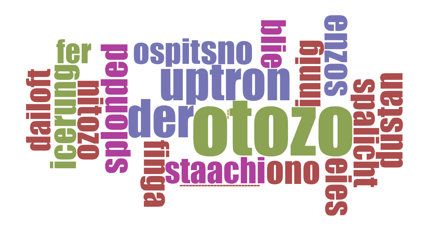 PARADES word cloud
vs.
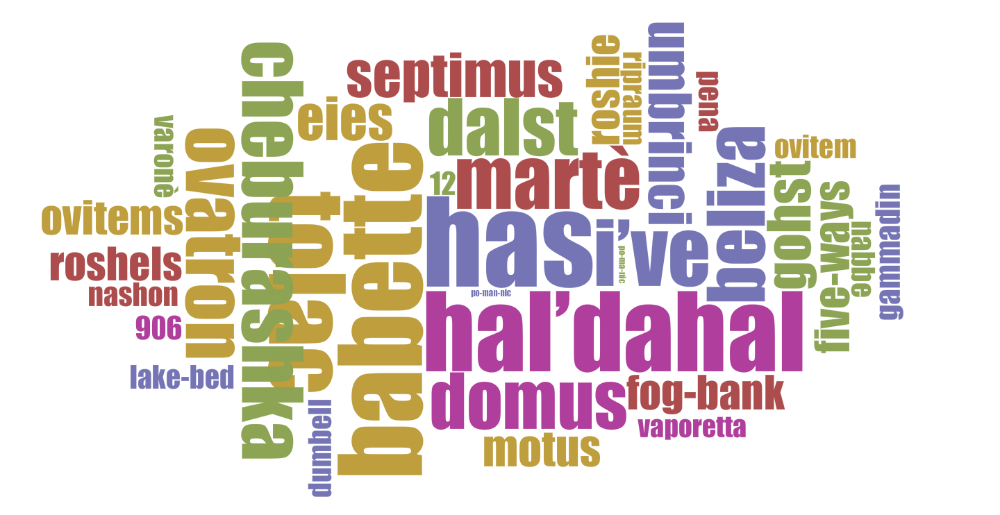 BABETTE word cloud
*****
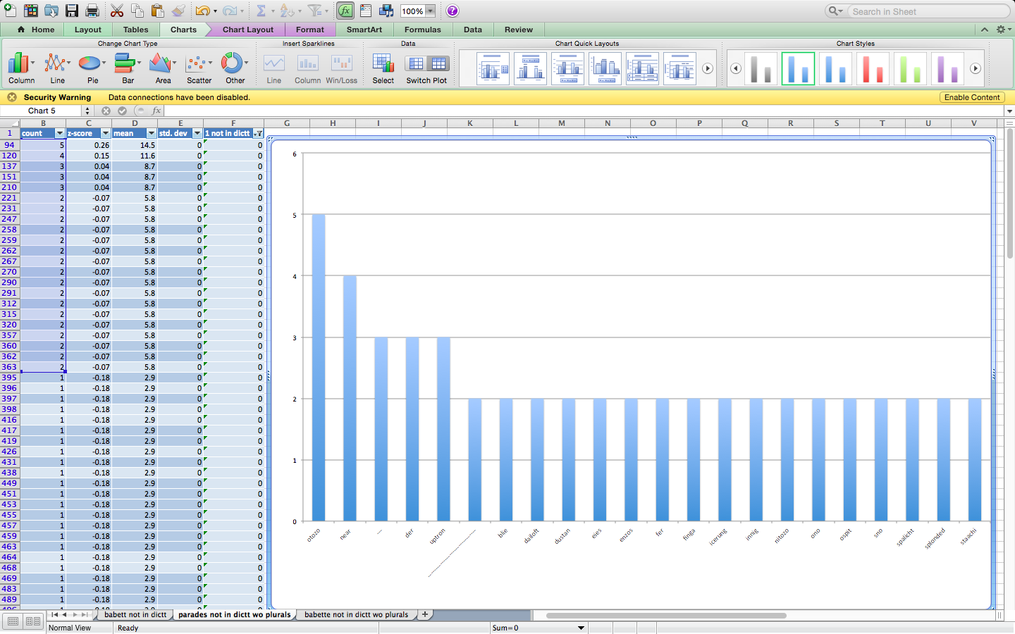 PARADES column graph (screen shot)
vs.
 BABETTE column graph (screen shot)
*****
What did I learn about the manuscripts from comparing their use of neologisms this way?
*****
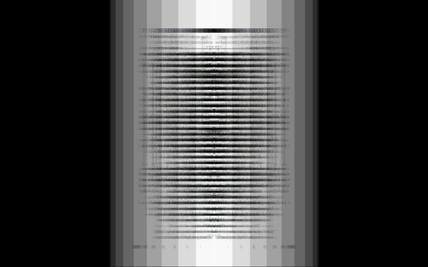
I ALSO tried to visualize the “form” (shape on the page) of the poems in each manuscript using IMAGE J – here are a few images and animations from my experiments with PARADES (you have to click on the links to get the animations… not sure they will work if IMAGE J isn’t downloaded) :

parades image J sequence parades images projection image j 2

Projection of Projection parades min z Projection of SUM_Projection
Officially, my data set project is an attempt at content analysis using a short story collection as my chosen data set. In reality, this was me taking apart a good book so I could fool around with Python and MALLET, both of which I am very new to. In my previous post, I indicated that I was interested in “what the investigation of cultural layers in a novel can reveal about the narrative, or, in the case of my possible data set, In the Country: Stories by Mia Alvar, a shared narrative among a collection of short stories, each dealing specifically with transnational Filipino characters, their unique circumstances, and the historical contexts surrounding these narratives.” I’ve begun to scratch at the surface.
I prepared my data set by downloading the Kindle file onto my machine. This presented my first obstacle: converting the protected Kindle file into something readable. Using Calibre and some tutorials, I managed to remove the DRM and convert the file from Amazon’s .azw to .txt. I stored this .txt file and a .py file I found on a tutorial for performing content analysis using Python under the same directory and started with identifying a keyword in context (KWIC). After opening Terminal on my macbook, I typed the following script into the command line:
python kwic1.py itc_book.txt home 3
This reads my book’s text file and prints all instances of the word “home” and three words on either sides into the shell. The abbreviated output from the entire book can be seen below:
Alisons-Air:~ Alison$ ls
Applications Directory Library PYScripts Test
Calibre Library Documents Movies Pictures mallet-2.0.8RC2
Desktop Downloads Music Public
Alisons-Air:~ Alison$ cd PYScripts/
Alisons-Air:PYScripts Alison$ ls
In the Country
Alisons-Air:PYScripts Alison$ cd In\ the\ Country/
Alisons-Air:In the Country Alison$ ls
itc_book.txt itc_ch1.txt itc_ch2.txt kwic1.py twtest.py
Alisons-Air:In the Country Alison$ python kwic1.py itc_book.txt home 3
or tuition back [home,] I sent what
my pasalubong, or [homecoming] gifts: handheld digital
hard and missed [home] but didn’t complain,
that I’d come [home.] What did I
by the tidy [home] I kept. “Is
copy each other’s [homework] or make faces
my cheek. “You’re [home,”] she said. “All
Immaculate Conception Funeral [Home,] the mortician curved
and fourth days [home;] one to me.
was stunned. Back [home] in the Philippines
farmer could come [home] every day and
looked around my [home] at the life
them away back [home,] but used up
ever had back [home—and] meeting Minnie felt
shared neither a [hometown] nor a dialect.
sent her wages [home] to a sick
while you bring [home] the bacon.” Ed
bring my work [home.] Ed didn’t mind.
“Make yourself at [home,”] I said. “I’m
when Ed came [home.] By the time
have driven Minnie [home] before, back when
night Ed came [home] angry, having suffered
coffee in the [homes] of foreigners before.
of her employer’s [home] in Riffa. She
fly her body [home] for burial. Eleven
of their employers’ [homes] were dismissed for
contract. Six went [home] to the Philippines.
the people back [home,] but also: what
she herself left [home.] “She loved all
I drove her [home,] and then myself.
we brought boys [home] for the night.
hopefuls felt like [home.] I showed one
She once brought [home] a brown man
time she brought [home] a white man
against me back [home] worked in my
the guests went [home] and the women
I’d been sent [home] with a cancellation
feed,” relatives back [home] in the Philippines
we’d built back [home,] spent our days
keep us at [home.] Other women had
Alisons-Air:In the Country Alison$
I chose the word “home” without much thought, but the output reveals an interesting pattern: back home, come home, bring home. Although this initial analysis is simple and crude, I was excited to see the script work and that the output could suggest that the book’s characters do focus on returning to the homeland or are preoccupied, at least subconsciously, with being at home, memories of home, or matters of the home. In most of In the Country’s chapters, characters are abroad as Overseas Filipino Workers (OFWs). Although home exists elsewhere, identities and communities are created on a transnational scale.
Following an online MALLET tutorial for topic modeling, I ran MALLET using the command line and prepared my data by importing the same .txt file in a readable .mallet file. Navigating back into the MALLET directory, I type the following command:
bin/mallet train-topics --input itc_book.mallet
— And received the following abbreviated output:
Last login: Sun Nov 29 22:40:08 on ttys001
Alisons-Air:~ Alison$ cd mallet-2.0.8RC2/
Alisons-Air:mallet-2.0.8RC2 Alison$ bin/mallet train-topics --input itc_book.mallet
Mallet LDA: 10 topics, 4 topic bits, 1111 topic mask
Data loaded.
max tokens: 49172
total tokens: 49172
LL/token: -9.8894
LL/token: -9.74603
LL/token: -9.68895
LL/token: -9.658470 0.5 girl room voice hair thought mother’s story shoulder left turn real blood minnie ago annelise sick wondered rose today sit
1 0.5 didn’t people work asked kind woman aroush place hospital world doesn’t friends body american began you’ve hadn’t set front vivi
2 0.5 back mother time house can’t you’re home husband thought we’d table passed billy family hear sat food stop pepe radio
3 0.5 day i’d made called school turned mansour manila don’t child things jackie mouth wasn’t i’ll car air boy watch thinking
4 0.5 hands years water morning mother head girl’s sound doctor felt sabine talk case dinner sleep told trouble books town asleep
5 0.5 he’d life man bed days found inside husband country call skin job reached wrote york past mind philippines chair family
6 0.5 time knew looked it’s she’d girls felt living i’m floor president fingers jim’s john young church jorge boys women nurses
7 0.5 baby hand city jaime door words annelise andoy heard he’s gave put lived that’s make white ligaya held brother end
8 0.5 milagros night face couldn’t year son brought men head money open they’d worked stood laughed met find eat white wrong
9 0.5 jim father home children eyes mrs milagros told long good years left wanted feet delacruz she’s started side girl streetLL/token: -9.62373
LL/token: -9.60831
LL/token: -9.60397
LL/token: -9.60104
LL/token: -9.596280 0.5 voice room you’re wife mother’s he’s story wrote closed walls stories america father’s ago line times sick rose thought today
1 0.5 didn’t people asked kind woman place hospital work city body doesn’t started front milagros american you’ve hadn’t held set watched
2 0.5 mother back house school thought can’t days bed minnie parents billy we’d table passed read sat stop high food they’re
3 0.5 day i’d made manila called don’t turned mansour child head hair jackie mouth dark wasn’t car stopped boy watch bedroom
4 0.5 man hands morning water reached doctor real sabine dinner sleep town asleep isn’t told dead letters loved slept press standing
5 0.5 husband he’d life family found inside call country skin live past daughter book mind chair wall heart window shoes true
6 0.5 time it’s knew looked felt she’d living i’m floor close president fingers things young began church boys women thing leave
7 0.5 baby hand jaime annelise door room words andoy hear heard lived put brother make that’s paper ligaya city end world
8 0.5 milagros night face couldn’t white son year brought men work job open stood they’d met money worked laughed find head
9 0.5 jim girl home years father children eyes aroush left good long mrs told she’s wanted girls love gave feet girl’sLL/token: -9.59296

LL/token: -9.59174

Total time: 6 seconds
Alisons-Air:mallet-2.0.8RC2 Alison$
It doesn’t make much sense, but I would consider this a small success only because I managed to run MALLET and read the file. I would need to work further with my .txt file’s content for better results. At the very least, this MALLET output could also be used to identify possible categories and category members for dictionary-based content analysis.
I resolved to write a journal of the time, till W. and J. return, and I set about keeping my resolve, because I will not quarrel with myself, and because I shall give William pleasure by it when he comes home again.
And so begins Dorothy Wordsworth’s Grasmere Journals (1800-1803). At first a strategy to cope with her loneliness while her brothers William and John were away, the journals were soon expanded in purpose to provide a record of what she saw, heard, and experienced around their home for the benefit of her brother’s poetry (apparently, he hated to write). There are numerous instances where her subject matter corresponds with his poems, down to the level of shared language. The most cited of these is an entry she made about seeing a field of daffodils; this was incorporated into the much-anthologized poem “I wandered lonely as a cloud,” which ends with a similar scene.
Dorothy and her brother William had a peculiar and unusually close relationship. She was more or less his constant companion before and after they moved to Grasmere. She copied down his poems, attended to his needs, and continued to live with him after he married and had a family, She herself never married, and remained with him until his death in 1850. For these reasons she is often portrayed as a woman who lived for him and vicariously through him.
This impression is reinforced by the nature of her writing, which focuses on the minutiae of day-to-day life, and isolated details of the world around her – weather, seasonal change, plants, animals, flowers, etc. – and which she mentions numerous times will be of use to her brother’s own work. Because her diaries chronicle many long walks in the surrounding countryside, alone or with friends and family, I originally planned to map her movements around the region and connect this movement to the people she was seeing in the area and corresponding with – to map her world, and see how hermetic and localized it really was.
I created the initial data set by downloading and cleaning a text file of the Journals from Gutenberg.org. There were many ways I could have worked with this data set to make it suitable for mapping. I ended up using several online platforms: the UCREL semantic tagger, Voyant Tools, CartoDB, and a visualization platform called RAW. Working back and forth with some of these programs enabled me to put the data into Excel spreadsheets to filter and sort in numerous ways.
When I began thinking about mapping strategies and recording the various data I extracted (locations, people, activities), I saw that to ensure accuracy I would have to corroborate much of it by going through the journals entry by entry – essentially, to do a close reading. Because I was hoping to see what could be gleaned from this text by distant reading, I chose to make a simple map of the locations she mentions in her journal entries, in relation to some word usage statistics provided by Voyant Tools. Voyant has numerous text visualization options, and working with them also encouraged me to think more about the role Dorothy’s writing had in her brother’s creative process; I was curious about how that might be visualized, in order to note patterns or consider the relationship between his defiantly informal poetic diction and her colloquial, quickly jotted prose.
So, I downloaded William Wordsworth’s Poems in Two Volumes, much of which was written during the same period, and processed it in a similar way. Using the RAW tools, I created some comparative visualizations with the total number words common to both texts. I’ve used the images that are easiest to read in my presentation, but there are others equally informative, that track the movement of language from one text to another.
If I were to return to the map and do a close reading, I would include a “density” component to reflect the amount of time Dorothy spent going to other locations, and perhaps add the people associated with those locations (there is a lot of overlap here), and the nature of activity.
I had some trouble winnowing my presentation down to three slides, but the images can be accessed here.
Also, thanks to Patrick Smyth for writing a short Python program for me! I didn’t end up using it but I think it will be very helpful for future data projects.
For my data project I used Processing to create a simple interactive animation of data I downloaded from the Global Terrorism Database. (My application file can be found here.**) For the sake of early draft ease, I limited the information that I pulled to all recorded global incidents from 2011 to 2014, which was still in excess of 40,000 incidents.
The motivation for this project was to create a dynamic display of information that I find difficult to contextualize. To that end, the app displays location, date, mode of attack, target, casualties, and motive, alongside an animation of frenetically moving spheres. The number of spheres is constant, but their size is scaled to the number of casualties. Thus as more people are injured and maimed the more overwhemed the screen becomes. The slider across the top of the window allows the user to move forward and back through time, while the displayed information and the animation updates to the data associated with her new position.
** It requires downloading the whole folder first and then clicking on the app icon. If you try to click through in Drive it will just show you the sub-folders that make it up. Also, for reasons that escape me, the file keeps breaking somewhere between upload and download. I’ll keep trying to fix this, but if the zip gods do not smile upon me, I’ll present with my laptop and run it from there. **
Hello.
Please click here to take a look at my data set. As you can see, it includes
All together, I have almost 85 years of aviation accidents. You have to agree it is a lot of data. As expected, the tool I am using , Carto DB, does not accept the format the data is provided in on Github. First I almost pushed the panic button while imagining the amount of time needed to transfer it to Excel, but luckily, Hannah Aizenman suggested I download and debug it, and then see if any manual cleaning is required. Downloading took a long time. Unfortunately, I do not know how to debug it yet. Therefore, for my presentation I have entered eight years of data into Excel spreadsheet manually.
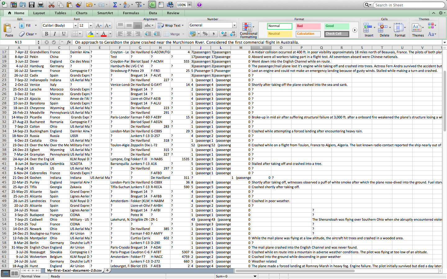
The categories I am working with are
| Date: | Date of accident, in the format – January 01, 2001 |
| Time: | Local time, in 24 hr. format unless otherwise specified |
| Airline/Op: | Airline or operator of the aircraft |
| Flight #: | Flight number assigned by the aircraft operator |
| Route: | Complete or partial route flown prior to the accident |
| AC Type: | Aircraft type |
| Reg: | ICAO registration of the aircraft |
| cn / ln: | Construction or serial number / Line or fuselage number |
| Aboard: | Total aboard (passengers / crew) |
| Fatalities: | Total fatalities aboard (passengers / crew) |
| Ground: | Total killed on the ground |
| Summary: | Brief description of the accident and cause if known |
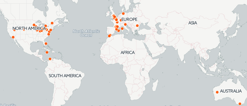
At this moment, I do not have enough data to make any conclusions, but questions have already started to arise. For example, is there a connection between the aircraft type and the number of accidents? De Havilland, Fokker, and KLM seem the most popular for now.
To better understand my data, I chose Carto DB as my tool. In the near future I should be able to see in what part of the world the most airplane accidents happened. For now, my map looks like this
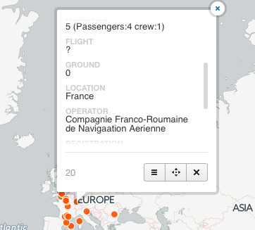
When clicked on a dot info about the accident appears
 I
I
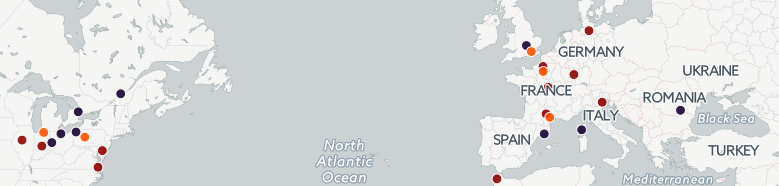
Ideally, I would like to have every ten years appear in different colors on the map. This kind of visualization should provide a deeper insight in my data.
Problems Encountered
I knew that Carto DB mostly recognized large cities. Surprisingly, it is sometimes able to find towns, too. So how do you georeference something that did not appear on the map? You need to go to the map’s data and look for what exactly did not show up. Then, go back to the map and search for the town you were looking for. At the bottom of the menu there is an “add” feature. Click it and click twice at the location you need. You can enter data manually. This is how I dealt with the little towns situation. When a plane accident over Gibraltar had to be georeferenced, I simply clicked twice on the map at the approximate location of the catastrophe. A new dot appeared and I entered the details manually.
Sometimes Carto DB is wrong. Spring Rocks Wyoming is in the USA, not Jamaica. A few other dots proved wrong, too. Do not know how to deal with this yet. Will ask digital fellows for advise.
Only three lawyers are available on Carto DB. It appears you have to pay for the rest. Good Destry told us about the two free tryout weeks:).
I have 85 years of data. In the first 8 years out of 122 accidents 24 did not get georeferenced. The amount of those in 85 years will be overwhelming. To enter all that data manually would take forever. I wonder if I could leave my map a little imperfect… Something worth asking our professors.
In general, it was rather interesting to research aviation accidents data. Now I know most tragedies happen due to bad weather. Conclusion: never complain about plane delays in winter!
May we stay safe, and may there be less tragedies in the world.
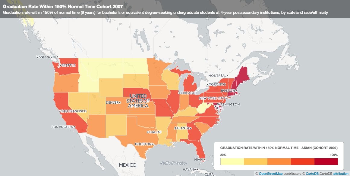
My data set project turned out a lot different from what I envisioned. I found my data from the Integrated Postsecondary Education Data System (IPEDS). They have a Trend Generator System, which easily helps you generate data, and you can see how this data changed over time. So, I looked at the percentage of bachelor students who graduated within 150% normal time (6 years) at 4 year postsecondary institutions in cohort year 2007. I broke the data down by state and race/ethnicity.
I wanted to do a mapping of this data to help us visualize these numbers. After seeing what UC Berkley did with their Urban Displacement project, my goal was to emulate something similar and continue to work on it for the final project. After using CartoDB, it was really not giving me what I wanted. I couldn’t separate the cluster of plotting points. Each layer also acted as an individual layer that didn’t add up with previous data/layers I mapped. For instance, here’s what I got when I added two other layers to the map:

The black and red bubbles aren’t really points…. Then I tried to create another map, a choropleth map. This map shows the different percentage of Asians who graduated at normal time. If you click on each state, a pop-up shows the graduation rate for other race/ethnic groups.
This wasn’t what I wanted at first, but it was what I got. Then I was thinking, is this enough? Do I need an actual map in my visualization? How does this map help me compare my data? I decided to turn to Plotly just to do some visualization with charts. Here was what I came up with:
A three y-axes graph:

A scatter plot:
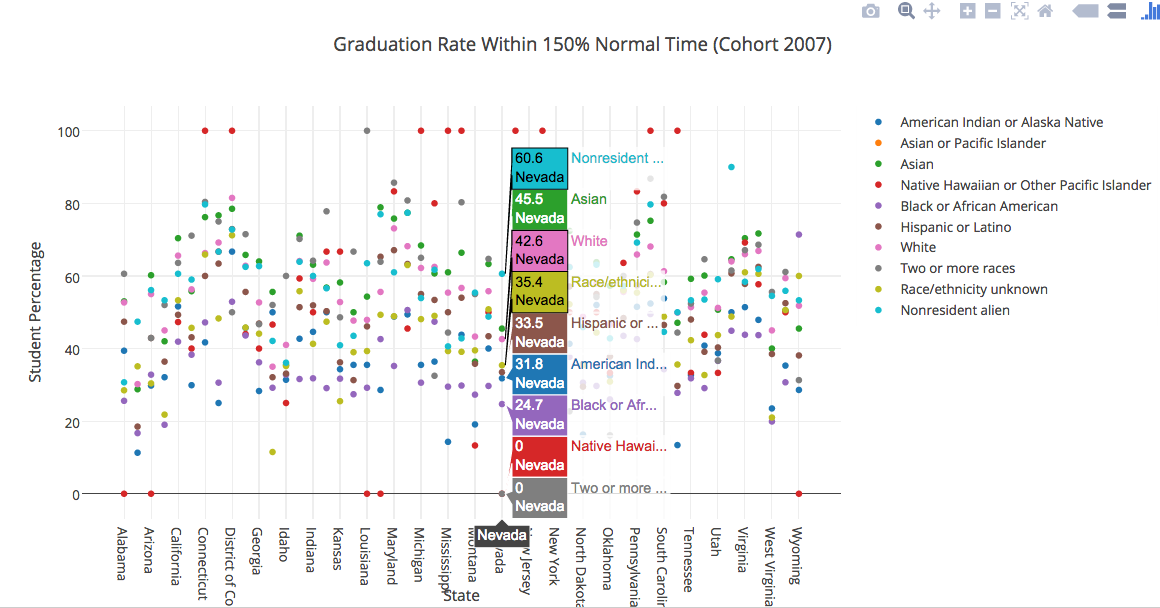
Even with these two charts, there’s still limitations to visually seeing the data. I’m hoping that in the next couple of weeks, I’ll either find a tool that matches with what I want or I’ll try to manipulate my data more and see what I get.