… my grade-school EXCEL classes !
they also taught us LOGO… it was 1995 or something… what a world.
… my grade-school EXCEL classes !
they also taught us LOGO… it was 1995 or something… what a world.
At Github I came across a dataset about plane crashes. Even though it is not something I am passionate about (in fact, I hope to not think too much about it while flying next time), the data raised my curiosity. At Accident Database they provide information about airplane accidents since 1921 till 2015. I was not sure how to verify this data. What I did was selecting a few random plane crashes and looking them up online. It worked, those calamities really happened.
It is hard to predict what questions I will be able to ask and answer once my data is ready to use. They say, the more you work on it the more correlations you see. For now, I have noticed that the number of airplane accidents during in 1945 does not differ much from from the one in 1957. Looking at the data closer revealed that almost all the airplane crashes documented in 1945 happened to the military planes, which means the regular ones weren’t flying because of World War II. Actually, my data set provides info on military plane crashes with more than 10 people aboard. One can only imagine how many small airplanes were destroyed.
With this being said, l am going back to working on my slides.
May we stay safe!
I see everyone is having issues with either their datasets or cartodb. I had problems syncing my excel data with cartodb. The free version has limited features like you stated Maple, so as far as layers are concerned its a dead issue. Since I wasn’t able to sync I had to manually put the data onto the map I created. Yesterday when I realized that I had to put in 56 street names on the map, I thought about switching, using something else, but that too proved to be fruitless. Hopefully the website for final project will be easier to maneuver.. Good luck ladies…
Hi everyone. As you know, I was going to work on the Indian boarding schools project. Unfortunately, I was not able to find data. All the people/libraries/organizations I contacted were very responsive, but regrettably, the information they provided was scarce. It turned out, I could not work on this project, because there was NO data to use/rely on. I have watched videos where Native Americans express their frustration about being the third generation of boarding school raised people, so I presumed that maybe I could track down at least a few families, but even that was not feasible. This kind of information is private. Do not misunderstand me, the information I need exists, but I would have to go to Washington DC to obtain it (most likely, no one even comprised it into a data set yet). I honestly did not expect this turn of events. To fight back frustration, I started to look for ideas in other people’s posts. That is how I learned Kat Vecchio found her data set on Github. So, I started browsing.
To be continued
For this data set project I have learned a number of things, one of which was creating a site on the CUNY Commons! Please check it out to read more about my project, see visualizations, and follow a twenty-day drama of their creation.
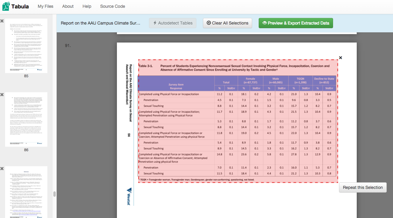
My data set project turned into an exercise in parsing and cleaning data before all else. I knew that I wanted to look into the current climate of sexual assault on college and university campuses, but there were a number of places to look for data on the issue. I landed on the Report on the Association of American Universities Campus Climate Survey on Sexual Assault and Sexual Misconduct. This report was the most recent, had the most immediately accessible data, and had been widely publicized when it was released earlier this fall. (See, for example, the NYTimes’s September article, “1 in 4 Women Experience Sex Assault on Campus.“) I contacted the AAU and made multiple attempts to access the original survey results, but in the end had to resort to the data tables as they appeared in the report.
This data table is where I began — with the percent of students experiencing different forms of nonconsensual sexual contact, organized according to their gender.

I then used the web software Tabula to scrape the data from the .pdf…
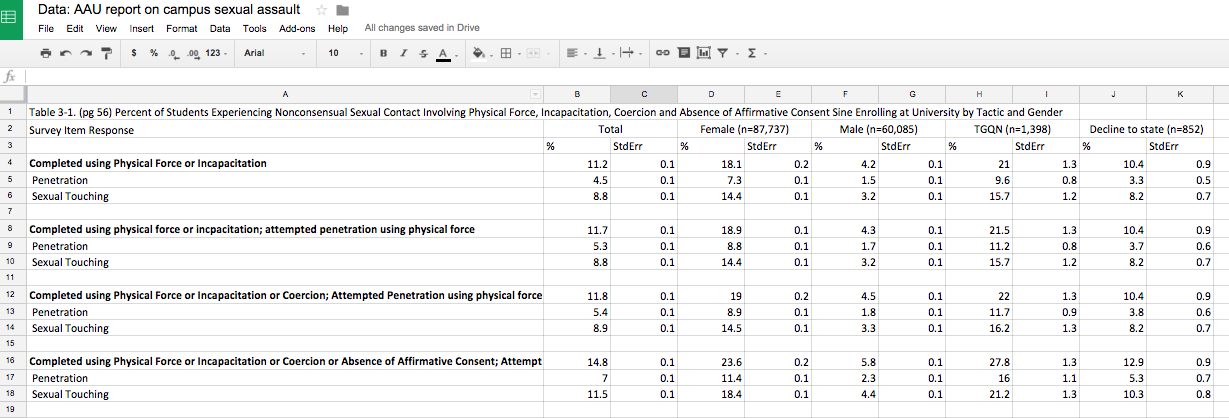
…cleaned and exported to Google Sheets…
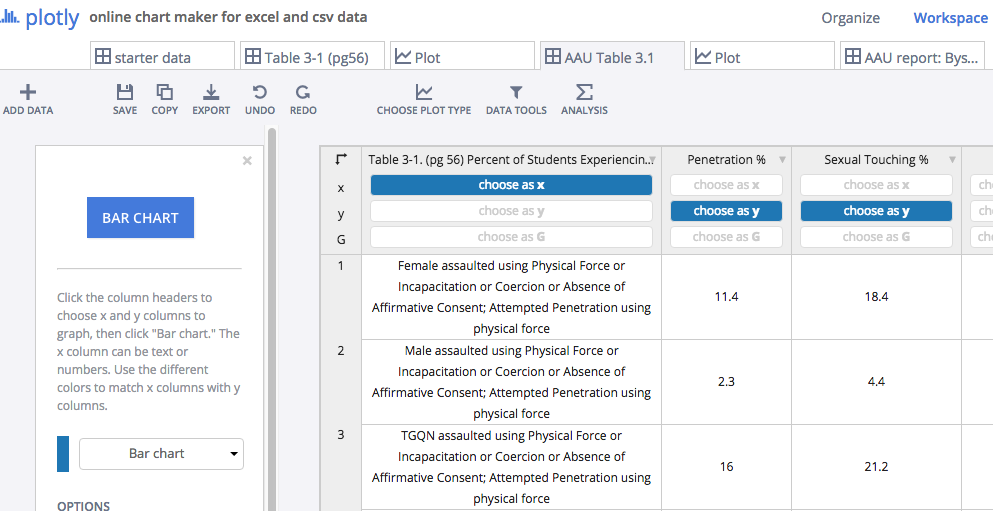
…and cleaned and imported into Plotly.
At every step of the way I was reorganizing the data to focus on the story that I most wanted. When I first started graphing, the data looked like this:
Until I continued to manipulate it to get it to look like this:

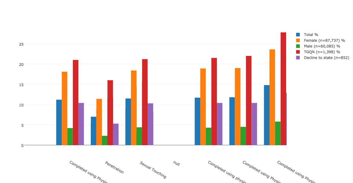
This exercise speaks to the amount of parsing, cleaning, selection, and editing that is necessary to arrive at even the simplest of bar charts. But I appreciate it for the new pieces of information that emerge from analyzing data through this process. For example, consider the high percentage of TGQN (that’s transgender women, transgender men, genderqueer, gender non-conforming, and questioning students, and those whose gender wasn’t listed) that are experiencing some form of assault on their campuses. Most media coverage of this issue has focused on the victimization of female students, but apparently there’s also a critical story here about the safety of TGQN students — something that I didn’t realize until I went through the motions of visualizing the data, and that probably a lot of other people are missing too.
As far as Plotly as a tool for visualization, I found it to be relatively easy to use, especially for someone who doesn’t know how to code. But I prefer Highcharts for the greater autonomy and flexibility it allows the user. That said, Highcharts is a JavaScript library, and as such requires some degree of JS knowledge to manipulate. For anyone who wants to churn out a pretty quick, pretty attractive, and very shareable graph, I think Plotly is a good choice.
Kathleen Fitzpatrick’s book, Planned Obsolescence, and the class discussion with her last Monday, has recently become relevant in my own path through academia. Over the course of last week and over the holiday weekend, I was asked by the English Dept. for my input on their proposals to re-model the first-year comprehensive exams.
You all may know about these in some way, but let me first briefly describe how it works, esp at CUNY / the GC. This is the exam that all PhD candidates in English must take before moving on to the next stage of their program. Not every department has them, but almost any PhD program in English seems to. I can’t speak to too many programs, but I do know that at Harvard, for example, they have a “Comprehensive Exam” they dub as the “100-book” exam: you must read and know a 100-book canon (gag me) like the back of your hand, and then go into a timed room of 3-4 faculty and spit out all your knowledge.
When I looked at the GC program, I was glad to see that it used a different model, one which didn’t seem to favor any particular canon. That said, it is still a full day, 8-hr, timed “exam,” in which you speed-respond to given essay prompts on an “empty” (brainless) computer.
After reports from students about the uselessness of this exam to measure their skills as thinkers / writers / teachers, and / or prepare them for “advanced study” (not to mention the fact that it penalizes students with learning disabilities or ESL), the Department has recently decided to try to change the model.
(Don’t worry, I’m going to get back to Kathleen’s points soon).
The model now under review is a “Portfolio” in the place of a test. It would consist of: one “conference paper,” one “review essay,” and one teaching syllabus.
As someone who has tested as “learning disabled,” I was certainly happy to hear that we were moving away from the timed exam.
And yet, looking back at Kathleen’s arguments made me re-think how “great” the Portfolio model really would be. As a poet, I’m interested in creative + critical teaching and practice… in building new “forms.” I’ve never written a review essay, and I’ve never attended an academic conference. I always worried that my lack of desire to do so would prevent me from getting my degree. But maybe I’m right: as Kathleen prescribes, we should be focusing more on the “process” of research, rather than the finished “product” (the review / conference papers). Maybe those are obsolete forms – forms that work towards the obsolete academic dissertation – which in turn work toward the obsolete academic book. Or am I just screaming in my head, “Don’t make me write a conference paper! I’m just a poet! Get me out of academia now!”
I have two answers to these questions. The first is: great, I finally have some smart argumentative backing (from Kathleen’s book, and our DH discussions all semester) to encourage my program to move away from the purely academic model of scholarship that is merely required, rather than wanted or needed. The second is: rather than wasting my time worrying that “pure academia” would come to get me, I should believe that I can actually interrogate these forms to create the type of work I want to do and see.
If we are given the Portfolio model, I have options, not limits. I can write, lets say, an open-access review essay. I can work collaboratively with other thinkers, perhaps even non-academic thinkers, online. I can write a conference paper both “about” and “demonstrating” joint creative and critical practice, and thereby question the form of the “paper” itself. I can certainly be grateful that I don’t have to spend all summer sweating about “failing” a biased timed-exam, and that I didn’t go to Harvard. Most importantly, I can think about the question of whether, by fixing the broken parts of a broken machine (rather than throwing them all away out of frustration, fear, and anxiety)… perhaps the machine will eventually start running well again; running somewhere new.
I stumbled across this article the other day, which seemed like something that would be of interest to the class. It also brought me back to the workshop on User Experience with Samantha Raddatz, which I attended a few weeks ago. In her workshop, she explained a few different methods for testing programs (focus groups, randomly approaching people in coffee shops, etc.) and the way that program/site/app designers often miss the most glaring issues with their own interface, how integral it is to test everything and to be open to the possibility of having to reorganize the information architecture of the site/app/etc. in order to best serve the people using the interface. It is necessary to go through a rigorous and diverse testing phase (although the best results do actually come from the first 5 people who test an app), in order to ascertain that the interface supports user expectation, and enables a positive, simple user experience.
The linked article looks at the user experience, and questions what drives user experience—not just the experience of using an app or site, but the experience of wanting to check it, wanting to be constantly connected. Apparently the concept of internet addiction has been discussed by psychologists since the advent of the first mainstream web browser, but as our technology becomes more and more streamlined and is streaming into the palms of our hands it has become a serious issue.
Is intuitive information architecture partially to blame for this? Does the ease of use create the sort of dependence we see when, on a Friday night, half the people in a bar are on their phones rather than interacting with other people in the bar? Does the ease of use and the resulting expectation of constant accessibility cause the frustration or anxiety many people feel when they don’t have service or wifi to quickly check their social media accounts on a smartphone?
For my data project, I have changed my mind so many times I can’t even begin to tell you where I started in terms of concept…but one idea branched off into another and finally I’m left with the idea of creating the beginnings of a thick map of terrorist activity in the US, with the intention of visualizing how our approach and classification of “terrorism” has changed in the wake of major incidents. For a final/next semester project, I think it would be interesting to focus specifically on creating a map that includes the events and that draws in the media conversations surrounding that event—for instance, mapping the Planned Parenthood shooting that occurred in Colorado last night, including the different ways people reacted to it on twitter, facebook, and in the news (if you look at #PPshooting or #PlannedParenthood on twitter, you’ll see some VERY revealing and diverse reactions to the event). I’m interested in the way that the idea of terrorism has infiltrated American culture and media, especially with relation to Islamophobia but also more generally for the scope of this project.
I really wanted to use the VisualEyes tool from University of Virginia and the NEH, however after much exploration I was not really able to learn how to use it. I like the final presentation of the data with this format, the sample projects on the visualeyes site seemed like exactly the kind of mapping I was looking for, and it is something I would like to really learn and explore in the future.
The point of my visualization, in the larger, more complex project scheme, is to map the way that terrorism and our reactions to it has changed.
For my data project I chose to work with a Titanic passenger data set, which had information about age, cabin class, gender, survival and other details. I wanted to explore the connection between gender and class as it related to the passenger survival rate.
Ultimately I ended up with a few mediocre graphs and a lot of hours spent trying to learn new tools.
I created the final graphs in an online interface called Quadrigram which has similar functionality to Excel’s graphing options. The Quadrigram interface is reminiscent of the Squarespace website building tools, and had a relatively easy learning curve. It allows you to publish your work on a website, for embedding or you can download the source code. While I didn’t need these functions, it would certainly be a good way to display charts on a project site. I also explored Excel’s chart functions but chose Quadrigram for the graphs to present. It took a little trail and error to figure out how to best format the data to achieve appropriate results, and all attempts at scatter plots were a profound disaster.
I downloaded Gephi which is an interactive visualization platform designed to illustrate connections. While it was interesting to explore it wasn’t the right fit for the questions I wanted to consider with this data set. Two programs which look promising, but that I was not able to explore yet are Analyse-it, which works with Excel to create data visualizations (only runs on PC) and Weave, though it does appear to have a steep learning curve.
For my presentation I’ll share the graphs and a quick overview of the Quadrigram interface.