Kathleen Fitzpatrick’s book, Planned Obsolescence, and the class discussion with her last Monday, has recently become relevant in my own path through academia. Over the course of last week and over the holiday weekend, I was asked by the English Dept. for my input on their proposals to re-model the first-year comprehensive exams.
You all may know about these in some way, but let me first briefly describe how it works, esp at CUNY / the GC. This is the exam that all PhD candidates in English must take before moving on to the next stage of their program. Not every department has them, but almost any PhD program in English seems to. I can’t speak to too many programs, but I do know that at Harvard, for example, they have a “Comprehensive Exam” they dub as the “100-book” exam: you must read and know a 100-book canon (gag me) like the back of your hand, and then go into a timed room of 3-4 faculty and spit out all your knowledge.
When I looked at the GC program, I was glad to see that it used a different model, one which didn’t seem to favor any particular canon. That said, it is still a full day, 8-hr, timed “exam,” in which you speed-respond to given essay prompts on an “empty” (brainless) computer.
After reports from students about the uselessness of this exam to measure their skills as thinkers / writers / teachers, and / or prepare them for “advanced study” (not to mention the fact that it penalizes students with learning disabilities or ESL), the Department has recently decided to try to change the model.
(Don’t worry, I’m going to get back to Kathleen’s points soon).
The model now under review is a “Portfolio” in the place of a test. It would consist of: one “conference paper,” one “review essay,” and one teaching syllabus.
As someone who has tested as “learning disabled,” I was certainly happy to hear that we were moving away from the timed exam.
And yet, looking back at Kathleen’s arguments made me re-think how “great” the Portfolio model really would be. As a poet, I’m interested in creative + critical teaching and practice… in building new “forms.” I’ve never written a review essay, and I’ve never attended an academic conference. I always worried that my lack of desire to do so would prevent me from getting my degree. But maybe I’m right: as Kathleen prescribes, we should be focusing more on the “process” of research, rather than the finished “product” (the review / conference papers). Maybe those are obsolete forms – forms that work towards the obsolete academic dissertation – which in turn work toward the obsolete academic book. Or am I just screaming in my head, “Don’t make me write a conference paper! I’m just a poet! Get me out of academia now!”
I have two answers to these questions. The first is: great, I finally have some smart argumentative backing (from Kathleen’s book, and our DH discussions all semester) to encourage my program to move away from the purely academic model of scholarship that is merely required, rather than wanted or needed. The second is: rather than wasting my time worrying that “pure academia” would come to get me, I should believe that I can actually interrogate these forms to create the type of work I want to do and see.
If we are given the Portfolio model, I have options, not limits. I can write, lets say, an open-access review essay. I can work collaboratively with other thinkers, perhaps even non-academic thinkers, online. I can write a conference paper both “about” and “demonstrating” joint creative and critical practice, and thereby question the form of the “paper” itself. I can certainly be grateful that I don’t have to spend all summer sweating about “failing” a biased timed-exam, and that I didn’t go to Harvard. Most importantly, I can think about the question of whether, by fixing the broken parts of a broken machine (rather than throwing them all away out of frustration, fear, and anxiety)… perhaps the machine will eventually start running well again; running somewhere new.
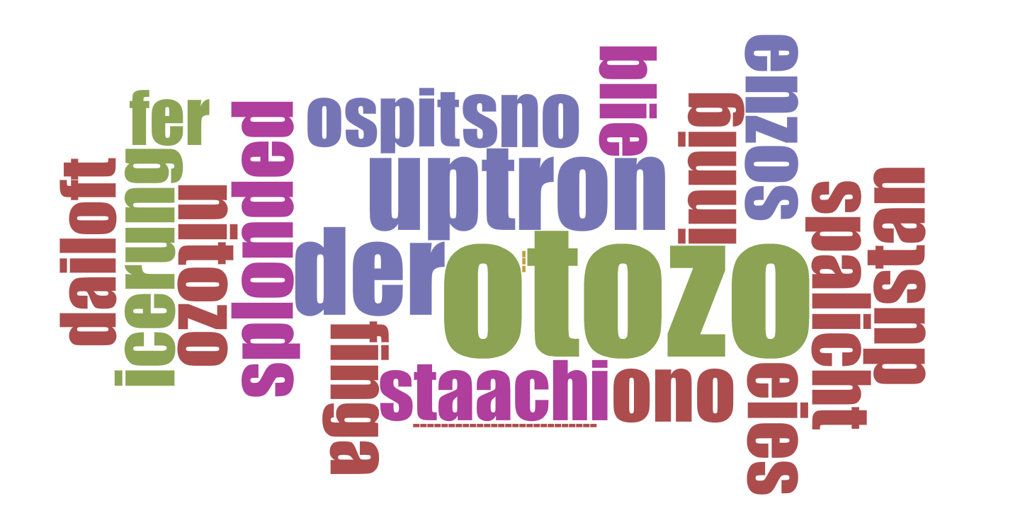 PARADES word cloud
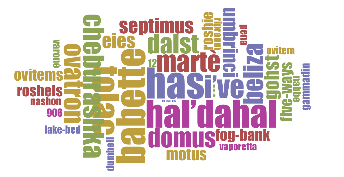 BABETTE word cloud
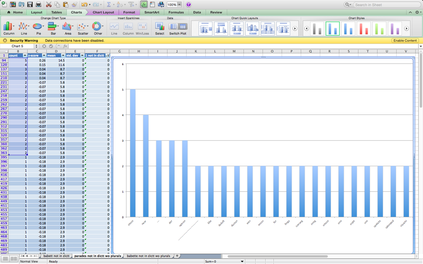 PARADES column graph (screen shot)
 BABETTE column graph (screen shot)